Title here
Summary here
The web is a responsive medium but sometimes you want to control its dimensions. Limiting line lengths is a great way to improve readability. How do you do that in a flexible medium?
You can use the ch unit to solve this problem.
It is equal to the width of the “0” character in your rendered font.
This unit lets you control line length based on text size instead of a fixed box width.
The ch unit is just one of many options in CSS.
We use numbers for opacity, line-height, and color values in rgb functions.
These are unitless integers like 1 or 100, or decimals like 0.5.
Numbers change meaning depending on the property you use them on.
For example, a unitless number on line-height acts as a ratio.
p {
  font-size: 24px;
  line-height: 1.5;
}
In this example, the line height computes to 36px. That is 1.5 times the font size of 24px.
Using unitless numbers for line height is a best practice. It lets child elements inherit the ratio instead of a fixed pixel height. That keeps the text readable if font sizes change down the line.
We also use unitless numbers for filters and opacity.
Setting opacity: 0.5 applies a 50% transparency.
You can scale elements with transform: scale(1.2) to increase their size by 120%.
Percentages in CSS are always calculated relative to something else.
For example, width is calculated as a percentage of the parent element’s width.
div {
  width: 300px;
  height: 100px;
}

div p {
  width: 50%;
}
Assuming default content-box sizing, the width of the paragraph is 150px.
Setting margin or padding as a percentage can surprise you.
The browser calculates both top and left percentages using the width of the parent element.
div {
  width: 300px;
  height: 100px;
}

div p {
  margin-top: 50%; /* 150px */
  padding-left: 50%; /* 150px */
}
Both values compute to 150px because the parent width is 300px.
Transforms work differently.
If you set a transform percentage, it is based on the element itself rather than the parent.
div {
  width: 300px;
  height: 100px;
}

div p {
  width: 50%; /* 150px */
  transform: translateX(10%); /* 15px */
}
The translateX value computes to 15px.
That is 10% of the paragraph’s own 150px width.
The transform property is great for moving, rotating, or scaling elements.
It works in both 2D and 3D spaces.
If you attach a unit to a number, it becomes a dimension.
For example, 1rem is a dimension.
Lengths are dimensions that refer to distance, and they can be absolute or relative.
Absolute lengths resolve to the same base value everywhere. They are highly predictable. Physical units like centimeters or inches do not always render accurately on screens because pixel densities vary. These units are best saved for print stylesheets.
div {
  width: 10cm;
  height: 5cm;
  background: black;
}
If you print this page, the block will be a 10 by 5 centimeter rectangle. Remember that CSS is for print stylesheets as well as screen layouts.
The px unit is the most common absolute unit for screens.
It equals 1/96th of an inch.
Other absolute units include cm for centimeters, mm for millimeters, in for inches, pt for points, and pc for picas.
A relative length is calculated against a base value. You can base sizes on parent font sizes or browser window dimensions. This makes relative units perfect for responsive layouts.
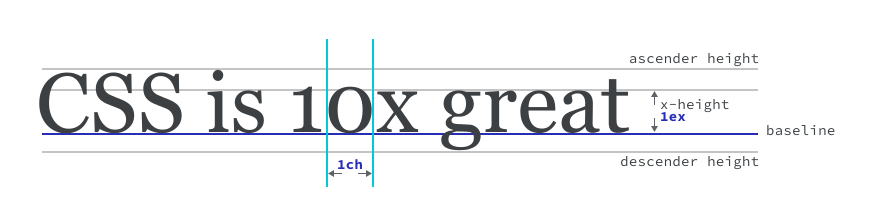
CSS offers units that relate to font metrics. You can use the size of the text itself or character shapes as your basis.
The em unit is relative to the element’s parent font size.
For example, 1.5em is 50% larger than the inherited font size.
The rem unit is relative to the root html element.
The root font size defaults to 16px in most browsers.
The ch unit is relative to the width of the “0” character in the current font.
Other relative units include ex for x-height, cap for capital letter height, and lh for line height.
You can size elements using the browser viewport width and height. These units split up the viewport window.
The vw unit represents 1% of the viewport width.
You can use it to scale headings dynamically as the screen resizes.
The vh unit represents 1% of the viewport height.
This is handy for sticking footers to the bottom of the screen.
The vi unit represents 1% of the inline axis.
In horizontal layouts, this is the width.
The vb unit represents 1% of the block axis.
In horizontal layouts, this is the height.
The vmin unit takes 1% of the smaller dimension.
The vmax unit takes 1% of the larger dimension.
div {
  width: 10vw;
}

p {
  max-width: 60ch;
}
In this example, the block spans 10% of the screen width. The paragraph has a maximum width of 60 characters.
Standard viewport units stay the same even when browser toolbars appear. Mobile browsers show and hide these bars as users scroll. You can use alternative units to handle this.
The lvw and lvh units represent the large viewport.
They assume all browser UI bars are hidden.
The svw and svh units represent the small viewport.
They assume all browser UI bars are visible.
The dvw and dvh units represent the dynamic viewport.
They change as user interface bars slide in and out.
You can size elements relative to a container instead of the whole screen. These are useful when writing container queries.
The cqw and cqh units represent 1% of the container width and height.
The cqi and cqb units represent 1% of the container inline and block sizes.
The cqmin and cqmax units represent the minimum and maximum container dimensions.
Sizing text with relative units like em or rem lets it respond to system settings.
This keeps your layout accessible for users who adjust their browser zoom or text size.
If you use px for font sizing, the browser might ignore those user settings.
Angle units help you rotate elements or define colors. They are useful in CSS transform functions and HSL colors.
div {
  width: 150px;
  height: 150px;
  transform: rotate(60deg);
}
The deg unit represents degrees.
Other angle units include rad for radians, grad for gradians, and turn for full rotations.
One turn equals 360 degrees.
Resolution units detect high-density screens. You can target them in media queries to swap in high-resolution images.
div {
  background-image: url('a-low-resolution-image.jpg');
}

@media (-webkit-min-device-pixel-ratio: 2), (min-resolution: 192dpi) {
  div {
    background-image: url('a-high-resolution-image.jpg');
  }
}
The dpi unit stands for dots per inch.
It is the most common way to check pixel density.
Adapted from Learn CSS © Google and contributors, licensed under CC BY 4.0 (prose) and Apache 2.0 (code samples).