Title here
Summary here
When you use a website, you might notice that many elements have a state. For example, dropdowns can be open or closed. Buttons might change color when focused or hovered. Modals appear and disappear.
By default, CSS switches the style of these states instantly.
Using CSS transitions, you can smoothly move between the start state and the end state of an element. The transition between the two states makes the site nicer to use. It gives the user visual hints about what their action did.
[!IMPORTANT] Interpolation is the process of making the in-between steps that smoothly transition from one state to another.
To use transitions in CSS, you can use the separate transition properties or the transition shorthand property.
transition-propertyThe transition-property property says which styles to transition.
.my-element {
  transition-property: background-color;
}
The transition-property accepts one or more CSS property names in a comma separated list.
You can also use transition-property: all to say that every property should transition.
transition-durationThe transition-duration property sets how long a transition takes to finish.
The transition-duration accepts time units, either in seconds (s) or milliseconds (ms).
It defaults to 0s.
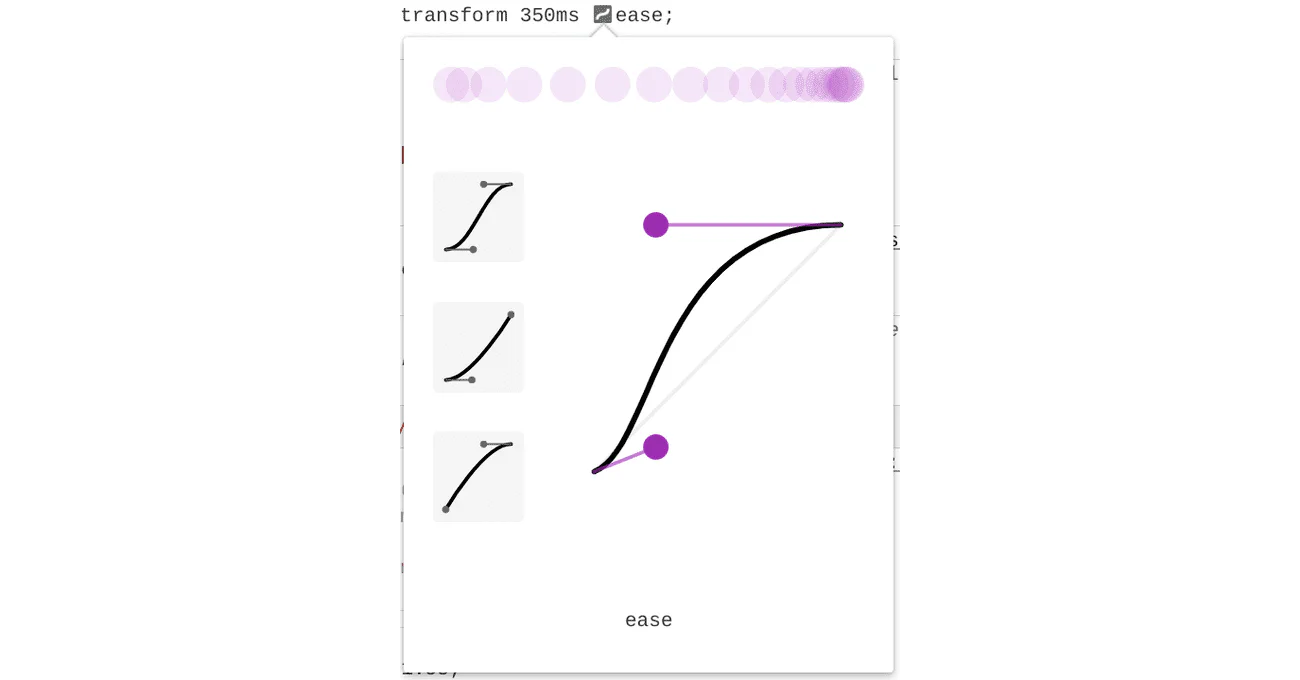
transition-timing-functionUse the transition-timing-function property to change the speed of a CSS transition over the course of the transition-duration.
By default, CSS moves your elements at a steady speed (transition-timing-function: linear).
Steady transitions can end up looking a bit fake.
In real life, objects have weight and can’t stop and start in an instant.
Easing into or out of a transition can make your transitions feel more lively and natural.
Our module on CSS animation has a good overview of timing functions.
You can use DevTools to try out different timing functions in real time.
transition-delayUse the transition-delay property to set when a transition starts.
If you don’t set transition-delay, transitions start right away because the default value is 0s.
This property accepts a time unit, for example seconds (s) or milliseconds (ms).
This property is handy for staggering transitions.
You do this by giving each item in a group a longer transition-delay than the one before it.
The transition-delay is also useful for debugging.
Setting the delay to a negative value can start a transition further into the timeline.
transitionLike most CSS properties, there is a shorthand version.
transition combines transition-property, transition-duration, transition-timing-function, and transition-delay.
.longhand {
  transition-property: transform;
  transition-duration: 300ms;
  transition-timing-function: ease-in-out;
  transition-delay: 0s;
}

.shorthand {
  transition: transform 300ms ease-in-out 0s;
}When you write CSS, you can pick which properties get animated transitions. See this MDN list of animatable CSS properties.
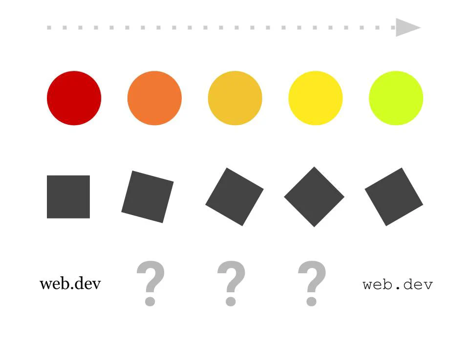
In general, you can only transition things that can have a middle state between their start and end states.
For example, you can’t add a transition for font-family.
It is not clear what the middle state between serif and monospace would look like.
On the other hand, you can add a transition for font-size.
Its unit is a length, and you can find a value in between two lengths.
Here are some common properties you can transition.
The transform CSS property is often transitioned.
It runs on the GPU, which gives smoother animation and uses less battery.
This property lets you scale, rotate, move, or skew an element however you like.
You can also use the scale, rotate, or translate properties to set separate transitions for each one, outside of a transform property.
Check out the section on transforms in our Functions module.
Before, during, and after an interaction, color can be a great way to show state. For example, a button might change color while you hover over it. This color change tells the user that the button can be clicked.
The color, background-color, and border-color properties are just a few places where you can transition color on interaction.
[!NOTE] Color transitions don’t usually need to be behind a reduced motion preference. Use your best judgment.
Check out our module on color.
Shadows are often transitioned to show a change in height, like when something gets user focus.
Check out our module on shadows.
filter is a powerful CSS property that lets you add graphic effects on the fly.
Transitioning between different filter states can give some pretty impressive results.
Check out our module on filters.
Your CSS must include a change of state and an event that triggers that change for a transition to run.
A common example of such a trigger is the :hover pseudo-class.
This pseudo-class matches when the user hovers over an element with their cursor.
Here is a list of some pseudo-classes and events that can trigger state changes in your elements.
:hover matches if the cursor is over the element.:focus matches if the element is focused.:focus-within matches if the element or any of its children are focused.:target matches when the current URL’s fragment matches the element’s id attribute value.:active matches when the element is being activated, which usually means the mouse is pressed over it.class change from JavaScript. When an element’s CSS class changes using JavaScript, CSS will transition any eligible properties that have changed.By setting different transition properties on hover or focus, you can create some interesting effects.
.my-element {
  background: red;

  /* This transition is applied on the "exit" transition */
  transition: background 2000ms ease-in;
}

.my-element:hover {
  background: blue;

  /* This transition is applied on the "enter" transition */
  transition: background 150ms ease;
}CSS transitions are not for everyone.
For some people, transitions and animations can cause motion sickness or discomfort.
Happily, CSS has a media feature called prefers-reduced-motion.
It detects whether a user has said they want less motion from their device.
/*
  If the user has expressed their preference for
  reduced motion, then don't use transitions.
*/
@media (prefers-reduced-motion: reduce) {
  .my-element {
    transition: none;
  }
}

/*
  If the browser understands the media query and the user
  explicitly hasn't set a preference, then use transitions.
*/
@media (prefers-reduced-motion: no-preference) {
  .my-element {
    transition: transform 250ms ease;
  }
}
Check out our blog post prefers-reduced-motion: Sometimes less movement is more for more on this media feature.
[!NOTE] In the Learn Accessibility module on animation and motion you can find out how to add delight to your site without causing problems for some users.
When you work with CSS transitions, you may hit performance issues if you add transitions for certain CSS properties.
For example, when properties like width or height change, they push the rest of the page around.
This forces CSS to work out new positions for every affected element for each frame of the transition.
When you can, we recommend using properties like transform and opacity instead.
Check out our guide on high-performance CSS animations for a deep dive on performance with CSS transitions.
Adapted from Learn CSS © Google and contributors, licensed under CC BY 4.0 (prose) and Apache 2.0 (code samples).