Title here
Summary here
Sometimes you see little helpers on an interface that give you useful information about a section when you click them. These often have a pulsing animation to quietly let you know the information is there and worth a look. This lesson shows you how to make those helpers, and other animations, using CSS.
You can use CSS to set up an animation sequence with keyframes. These sequences can be simple one-state animations or complex timed sequences.
In most animation tools, keyframes are how you assign animation states to points in time on a timeline.
For example, here is a timeline for the pulsing helper dot. The animation runs for 1 second and has 2 states.
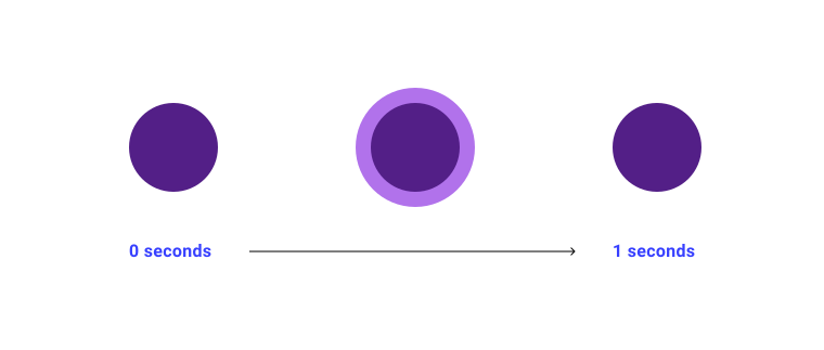
There is a specific point where each of these animation states starts and ends. You map these out on the timeline with keyframes.
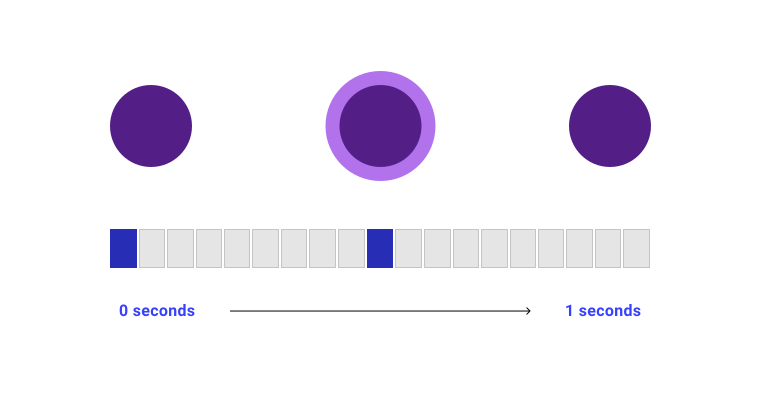
@keyframesCSS @keyframes are based on the same idea as animation keyframes.
Here is an example with two states.
@keyframes my-animation {
  from {
    transform: translateY(20px);
  }
  to {
    transform: translateY(0px);
  }
}
The first important part is the custom identifier (custom-ident), the name of the keyframes rule.
The identifier in this example is my-animation.
The custom identifier works like a function name.
It lets you point to the keyframes rule elsewhere in your CSS code.
[!NOTE] A
<custom-ident>is used in various places in CSS to let you give your own name to things. These names are case sensitive, and in some cases there are words you can’t use. For example, when naming lines in CSS grid, you can’t use the wordspan.
Inside the keyframes rule, from and to are keywords that stand for 0% and 100%.
These are the start and end of the animation.
You could write the same rule like this.
@keyframes my-animation {
    0% {
        transform: translateY(20px);
    }
    100% {
        transform: translateY(0px);
    }
}
You can add as many positions as you like along the timeframe. In the pulsing helper example, there are two states that turn into two keyframes. This means you have two positions inside your keyframes rule to set the changes for each keyframe.
@keyframes pulse {
  0% {
    opacity: 0;
  }
  50% {
    transform: scale(1.4);
    opacity: 0.4;
  }
}animation propertiesTo use your @keyframes in a CSS rule, you can set the animation properties one by one.
Or you can use the animation shorthand property.
animation-duration.my-element {
animation-duration: 10s;
}The animation-duration property sets how long the @keyframes timeline should be, as a time value.
It defaults to 0 seconds, which means the animation still runs, but it will be too quick for you to see.
You can’t use negative time values.
animation-timing-functionTo help make motion look natural, you can use timing functions that work out the speed of an animation at each point.
The values are often curved, which makes the animation run at different speeds over the course of animation-duration.
It can also make the element appear to bounce if the browser works out a value beyond the ones you set in @keyframes.
There are several keywords built into CSS that you can use as the value for animation-timing-function.
These are linear, ease, ease-in, ease-out, and ease-in-out.
.my-element {
    animation-timing-function: ease-in-out;
}
Timing function values look curved because the speed is worked out using a Bézier curve.
A Bézier curve is a type of function used to model speed.
Each of the timing function keywords, such as ease, points to a predefined Bézier curve.
In CSS, you can define a Bézier curve directly using the cubic-bezier() function.
It takes four number values, x1, y1, x2, and y2.
.my-element {
    animation-timing-function: cubic-bezier(.42, 0, .58, 1);
}
These values plot each part of the curve along the X and Y axis.
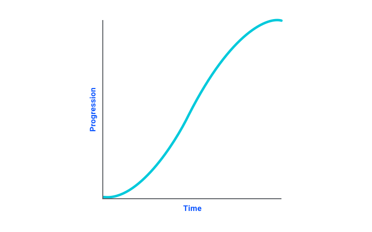
Bézier curves are tricky to understand. Visual tools, such as this generator by Lea Verou, are very helpful.
steps easing functionSometimes you want more control over your animation by moving in steps instead of along a curve.
The steps() easing function lets you break the timeline into set intervals of equal length.
.my-element {
    animation-timing-function: steps(10, end);
}
The first argument is the number of steps. If there are the same number of keyframes as steps, each keyframe plays in turn for the exact length of its step, with no change between states. If there are fewer keyframes than steps, the browser adds steps between keyframes based on the second argument.
The second argument is the direction.
If it is set to end, which is the default, the steps finish at the end of your timeline.
If it is set to start, the first step of your animation finishes as soon as it starts, so it ends one step earlier than end.
animation-iteration-count.my-element {
animation-iteration-count: 10;
}The animation-iteration-count property sets how many times the @keyframes timeline should run during the animation.
By default this is 1, which means the animation stops when it reaches the end of your timeline.
This value can’t be a negative number.
To make your animation loop, set the iteration count to infinite.
This is how the pulsing animation from the start of this lesson works.
animation-direction.my-element {
animation-direction: reverse;
}You can set which direction the timeline runs over your keyframes with animation-direction. It takes the following values.
normal is the default value, which is forward.reverse runs backward over your timeline.alternate switches the timeline between running forward and running backward on each animation iteration.alternate-reverse is like alternate, but the animation starts with the timeline running backward.animation-delay.my-element {
animation-delay: 5s;
}The animation-delay property sets how long the browser waits before starting the animation.
Like the animation-duration property, this takes a time value.
Unlike animation-duration, you can set animation-delay to a negative value.
This makes the animation start at the matching point in your timeline.
For example, if your animation is 10 seconds long and you set animation-delay to -5s, the animation starts from halfway through your timeline.
animation-play-state.my-element:hover {
animation-play-state: paused;
}The animation-play-state property lets you play and pause the animation.
The default value is running.
If you set it to paused, the animation pauses.
animation-fill-modeThe animation-fill-mode property sets which values in your @keyframes timeline stick around before the animation starts or after it ends.
The default value is none, which means the values in your timeline are thrown away once the animation is done.
The other options are listed here.
forwards keeps the last keyframe, based on the animation direction.backwards keeps the first keyframe, based on the animation direction.both keeps both the first and last keyframes.animation shorthandInstead of setting each property on its own, you can set them all in an animation shorthand.
It lets you set the animation properties in the following order.
animation-nameanimation-durationanimation-timing-functionanimation-delayanimation-iteration-countanimation-directionanimation-fill-modeanimation-play-state.my-element {
animation: my-animation 10s ease-in-out 1s infinite forwards forwards running;
}Users can set their operating system to prefer reduced motion when they use apps and websites. You can detect this preference with the prefers-reduced-motion media query.
@media (prefers-reduced-motion) {
  .my-autoplaying-animation {
    animation-play-state: paused;
  }
}
This isn’t always a preference for no animation. It is a preference for less animation, especially less surprising animation. You can learn more about this preference and overall performance in our animation guide.
Adapted from Learn CSS © Google and contributors, licensed under CC BY 4.0 (prose) and Apache 2.0 (code samples).