Title here
Summary here
The way a web page is drawn is built on top of the box model, so elements are rectangles. But there is more to design than rectangles. CSS gives you a few ways to change which parts of an element show up. This lets you make designs in all kinds of shapes and sizes. Clipping lets you cut an element into a geometric shape. Masking changes what you can see one pixel at a time.
CSS uses functions to define shapes.
We cover the general idea of functions in the CSS Functions module.
In this section you will learn how to make shapes in CSS.
All of the examples below use the shapes you make with the clip-path property.
This property cuts the element down so you only see what is inside the shape.
That lets the element look different from its normal box.
We cover clipping in more detail later on.
Shapes in CSS can be basic shapes, such as circles, rectangles, and polygons. They can also be paths, which can describe complex shapes and shapes made of more than one part.
circle() and ellipse()The circle() and ellipse() functions make round and oval shapes.
Their size is set relative to the element.
The circle() function takes a single size or percentage as an argument.
By default, both functions place the shape in the center of the element.
Both also take an optional position after the at keyword.
You can write that position as a length, a percentage, or a position keyword like top.
.my-element {
  width: 60px;
  height: 60px;
  background: blue;
  clip-path: circle(50%);
}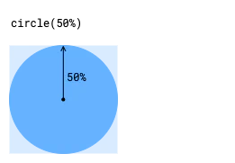
The example above shows a circular clipping path made with the circle() function.
A radius of 50% makes a circle the full width of the element.
The ellipse() function takes two arguments, the horizontal radius and the vertical radius of the shape.
.my-element {
  width: 60px;
  height: 60px;
  background: blue;
  clip-path: ellipse(50% 25%);
}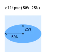
The example above shows an elliptical clipping path made with the ellipse() function.
A radius of 50% makes an ellipse the full width of the element.
The next example shows the same ellipse, but with its center moved to the top of the element.
.my-element {
  width: 60px;
  height: 60px;
  background: blue;
  clip-path: ellipse(50% 25% at center top);
}
rect() and inset()The rect() and inset() functions give you two ways to make a rectangle.
You set where its sides sit relative to the sides of the element.
This lets you make rectangles that look different from the element’s normal box.
Both can take the round keyword to round the corners.
The rounding uses the same syntax as the border-radius shorthand property.
The rect() function sets the top and bottom sides relative to the top edge of the element.
It sets the left and right sides relative to the left edge of the element.
This function takes four size or percentage values, for the top, right, bottom, and left sides.
You might pick rect() when you want a rectangle that does not scale as the element changes size.
You might also pick it when you want a rectangle that keeps the same proportions as the element changes.
.my-element {
  width: 80px;
  height: 60px;
  background: blue;
  clip-path: rect(15px 75px 45px 10px);
}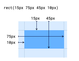
The example above shows a rectangular clipping path made with the rect() function.
The sizes are relative to the top and left edges of the element, as shown in the diagram.
The inset() function sets the sides of a rectangle by how far they move inward from each side of the element.
This function takes one to four size or percentage values, so you can set more than one side at once.
You might pick inset() when you want a rectangle that scales with the element.
You might also pick it when you want a rectangle that stays a fixed distance from the element’s edges.
.my-element {
  width: 80px;
  height: 60px;
  background: blue;
  clip-path: inset(15px 5px 15px 10px);
}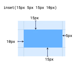
The example above shows a rectangular clipping path made with the inset() function.
The sizes are relative to the sides of the element.
The rect() and inset() functions can also take the round keyword to round the corners.
The rounding uses the same syntax as the border-radius shorthand property.
The next example shows rounded versions of the rectangles from before.
.rounded-rect {
  width: 80px;
  height: 60px;
  background: blue;
  clip-path: inset(15px 5px 15px 10px round 5px);
}

.rounded-inset {
  width: 80px;
  height: 60px;
  background: blue;
  clip-path: inset(15px 5px 15px 10px round 5px);
}polygon()For other shapes, such as triangles, pentagons, and stars, you can use the polygon() function.
It lets you make a shape by joining points with straight lines.
The polygon() function takes a list of pairs of values, each a length or a percentage.
Each pair is one point on the polygon.
The first value is the distance from the left edge of the element.
The second value is the distance from the top edge of the element.
You don’t need to close the polygon yourself.
The browser joins the last point back to the first point for you.
.my-element {
  width: 60px;
  height: 60px;
  background: blue;
  clip-path: polygon(
    50% 0,
    0 100%,
    100% 100%
  );
}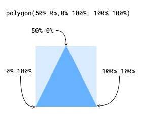
The example above makes a triangular clipping path by setting three points.
By default, the polygon() function fills any area where the shape overlaps itself.
You can change this with an optional first argument called the fill rule.
To switch between filled and empty areas, set the fill rule to evenodd.
To use the default fill rule, set it to nonzero.
The example above uses the polygon() function with trigonometric functions to make regular polygons and stars.
It does not make the largest polygon that fits inside the element, and it does not center it.
We will leave that as an exercise for you to try.
The stars in this example also show the nonzero and evenodd fill rules.
Sometimes the basic shape functions are not enough to describe a shape. For those cases, CSS gives you functions with a richer syntax that can describe curves and lines. These functions are also useful for compound shapes. A compound shape is one made of more than one shape, such as a circle with a hole in it.
path()The path() function takes a string of SVG path syntax to describe a shape.
This lets you make complex shapes using instructions that describe the lines and curves in the shape.
Editing the SVG syntax by hand can be hard.
So we suggest using a visual editor that can export the syntax when you make shapes with the path() function.
The path() function does not use CSS sizing units, and it reads every value as pixels.
This means shapes made with the path function do not respond to the size of the element or the container.
We suggest using path() only for shapes that have fixed sizes.
shape()[!NOTE] The
shape()function is not currently supported in Firefox.
The shape() function uses a command syntax to describe a shape, much like the path() function.
But the shape() function commands are native CSS, so they can use CSS size units.
This lets shapes made with the shape() function scale with their size.
The example above uses the path() and shape() functions to make a heart shape and a circle with a hole in the center.
The example uses the same pixel value for both functions.
But the shape() function could have used other CSS size units, such as percentages or container relative units.
Clipping sets which areas of an element you can see.
It is a bit like cutting an image out of a magazine.
The clip-path property sets the path that defines the clip area.
As you saw in the earlier examples, any of the basic shape or path functions can be used as the clip-path.
The clip-path property also supports paths defined in an SVG clipPath element.
That element can be embedded in the page or kept in a separate file.
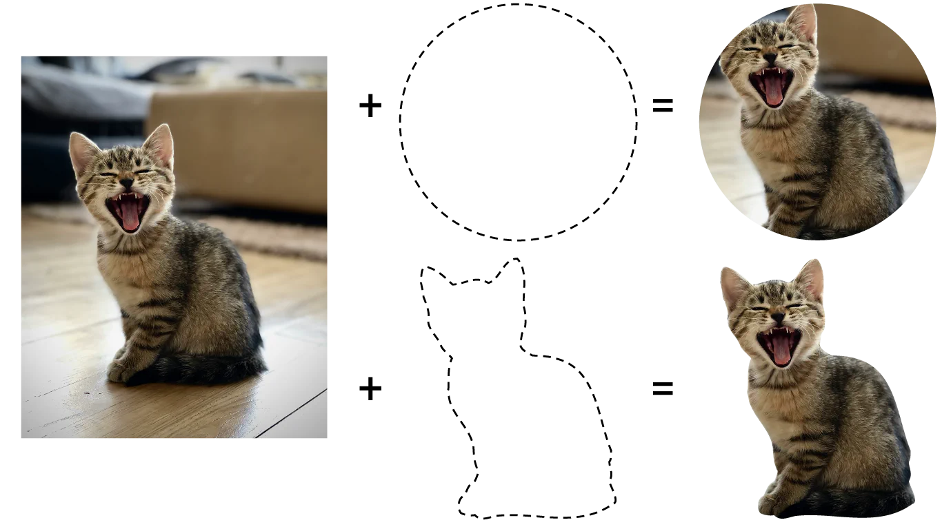
The diagram above shows how adding a clip-path to an image changes the visible area of the image.
The upper clip path uses the circle() function.
The lower one uses an SVG clipPath.
Note that the circle made with the circle() function is centered on the element by default.
The clip-path property only accepts a single path.
To clip an element with several shapes that don’t overlap, use the path() or shape() functions to define one compound path, or use an SVG clipPath.
Another option for tricky cases is to use masking instead of clipping, which we cover in a later section.
To clip with a basic shape or path function, set the clip-path property to the value the function returns, like in the earlier examples.
Each function places the clipping shape differently relative to the element, so check the reference for each function.
In the example above, two elements have a circular clip-path applied with the .clipped class.
Note that the clip-path is placed relative to each element.
Note too that the text inside the clip-path does not reflow to follow the shape.
By default, the clipping path for an element includes the element’s border.
When you use one of the basic shape functions, you can set the reference box of the clip path to include only the area inside the border.
The valid values for the reference box are stroke-box, which is the default, and fill-box, which includes only the area inside the border.
The example above shows elements with a large 20px border, each using the inset() function to set the clip-path.
The element that clips relative to the border still shows part of the border.
The elements that clip relative to the area inside the border show no border and are smaller, even with the same inset value.
A clipping path can be defined in an SVG document. The SVG can be embedded in the HTML document or referenced from another file. This is useful for complex clipping paths made in graphics programs, or for clipping paths that combine several shapes.
<img id="kitten" src="kitten.png">

<svg>
  <defs>
    <clipPath id="kitten-clip-shape">
      <circle cx="130" cy="175" r="100" />
    </clipPath>
  </defs>
</svg>

<style>
  #kitten {
    clip-path: url(#kitten-clip-shape);
  }
</style>
In the example above, the clipPath with an id of kitten-clip-shape is applied to the <img> element.
Here the SVG document is embedded in the HTML.
If the SVG document were an external file named kitten-clipper.svg, then the clipPath would instead be referenced as url(kitten-clipper.svg#kitten-clip-shape).
Masking is another way to set which areas of an element show or hide. Clipping uses basic shapes or paths. Masking uses the pixels from an image or a gradient to decide what you can see. Unlike clipping, masking lets areas of an element be partly see through. You can apply more than one mask image to an element to make a range of effects.
To apply a mask, set the mask-image property.
This property accepts one or more images, gradients, or references to <mask> elements in an SVG document.
You can apply more than one mask image by separating them with commas.
.my-element {
  mask-image: url(my-mask.png),
              linear-gradient(black 0%, transparent 100%);
}
In the example above, .my-element is masked with a PNG image, followed by a linear gradient.
By default, multiple masks are added together to make the final mask.
The example above shows an image with one or more masks applied. Toggle each mask to see how the masks add together to make the final effect.
You can apply a mask using either the alpha or the luminance of the image.
When you mask based on alpha, the transparency of each pixel in the mask image is applied to the element, and the color of that pixel is ignored.
When you mask based on luminance, both the transparency and how bright or dark each pixel is are applied to the element.
Masking by luminance treats brighter colors as visible and darker colors as invisible.
To set the masking mode, use the mask-mode property.
By default, the mask-mode property is set to match-source, which picks a mode based on the type of the mask image.
For images and gradients, this defaults to alpha.
For SVG masks, this defaults to the value of the <mask> element’s mask-type property, or to luminance if there is no mask-type defined.
In the example above, a test pattern showing different color and alpha values is used as a mask.
By toggling the mask-mode, you can see how alpha mode is based on transparency, while luminance mode is based on both color brightness and transparency.
CSS gives you more properties to fine tune how your masks behave.
Each of these properties accepts a comma separated list of values, which is matched to the list of masks set by the mask-image property.
If there are fewer values than masks, the list repeats until each mask has a value.
If there are more values than masks, the extra values are thrown away.
| Property | Description |
|---|---|
https://developer.mozilla.org/docs/Web/CSS/mask-clip | Sets which reference box of the element masks are applied to. Defaults to border-box. |
https://developer.mozilla.org/docs/Web/CSS/mask-composite | Sets the interaction between masks when multiple masks are applied to the same element. Defaults to add. |
https://developer.mozilla.org/docs/Web/CSS/mask-origin | Sets the reference box that acts as the origin of a mask. Defaults to border-box. This behaves similarly to background-origin and accepts the same keywords. |
https://developer.mozilla.org/docs/Web/CSS/mask-position | Sets the position of a mask relative to the mask-origin. Accepts position keyword values such as top or center, percentages, size units, or values relative to a position keyword. This behaves similarly to background-position and accepts the same argument types. |
https://developer.mozilla.org/docs/Web/CSS/mask-repeat | Sets how a mask repeats if the masked element is larger than the mask. Defaults to repeat. This behaves similarly to background-repeat and accepts the same argument types. |
https://developer.mozilla.org/docs/Web/CSS/mask-size | Sets how a mask resizes relative to the size of the masked element. Defaults to auto. This behaves similarly to background-size and accepts the same argument types. |
You can set several mask properties at once with the mask shorthand.
This can make it simpler to set multiple masks by grouping all the properties of each mask together.
The mask shorthand sets these properties in this order.
mask-image, mask-mode, mask-position, mask-size, mask-repeat, mask-origin, mask-clip, and mask-composite.
You don’t need to include every property, and any you leave out are reset to their starting value.
With support for up to eight properties per mask, it can help to keep a full reference on hand.
.longhand {
  mask-image: linear-gradient(white, black),
              linear-gradient(90deg, black, transparent);
  mask-mode: luminance, alpha;
  mask-position: bottom left, top right;
  mask-size: 50% 50%, 30% 30%;
}

.shorthand {
  mask: linear-gradient(white, black) luminance bottom left / 50% 50%,
        linear-gradient(90deg, black, transparent) alpha top right / 30% 30%;
}
In the example above, each class has two masks applied.
The first uses individual properties, while the second uses the mask shorthand.
Both styles are the same as each other.
When you clip or mask an element, you only change the visible area inside its box.
The box itself stays the same.
This means a floated element affects the document flow based on its original box, not on the parts you can see.
To set how content flows around an element, use the shape-outside property along with the clip path.
The shape-outside property sets the shape that content flows around an element.
This shape can be any of the basic shape functions.
It cannot be a shape made with the path() or shape() functions, or a clipPath defined in an SVG document.
The shape-outside property also accepts an image or a gradient.
As with masking, the transparency of the image or gradient sets the boundary of the shape.
The shape-image-threshold property sets which levels of transparency count as inside the shape.
You can animate the clip-path property, blending from one shape to another.
You must use the same shape function for each keyframe to get a smooth animation.
When you use the polygon() or shape() functions, you must use the same number of points in each keyframe.
In the example above, the clip-path of an element moves between a pentagon and a star, both made with the polygon() function.
The example uses the evenodd fill rule to show how the moving points make overlapping areas.
You can also animate elements along the paths made with these shape functions.
The offset-path property sets the shape to use as the path.
The offset-distance property sets the position along that path.
You can also use the ray() function with the offset-path property to animate along a straight line.
The example above uses the same polygon for both a clip-path and an offset-path.
The animation uses offset-distance to move the smaller stars along the same polygon the large star uses as its clip-path.
Adapted from Learn CSS © Google and contributors, licensed under CC BY 4.0 (prose) and Apache 2.0 (code samples).