Title here
Summary here
So far in this course, you’ve seen several CSS functions.
In the grid module, you met minmax() and fit-content(), which help you size elements.
In the color module, you met rgb() and hsl(), which help you define colors.
Like many other programming languages, CSS has a lot of built-in functions that you can use whenever you need them.
Every CSS function has a specific purpose. In this lesson, you’ll get a high-level overview. This will give you a much better understanding of where and how to use them.
A function is a named, self-contained piece of code that does a specific task. A function is named so you can call it within your code. You can also pass data into the function. This is known as passing arguments.
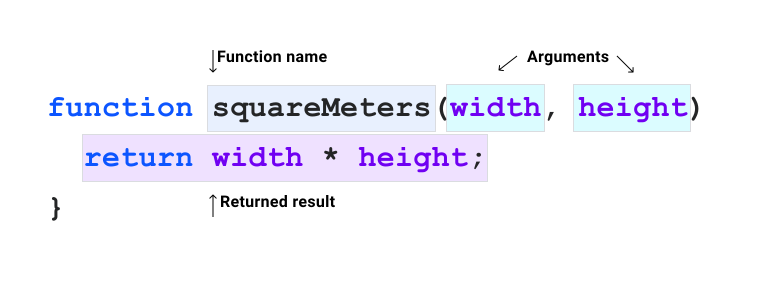
A lot of CSS functions are pure functions.
This means that if you pass the same arguments into them, they always give you the same result back.
That holds true no matter what is happening in the rest of your code.
These functions will often re-compute as values change in your CSS.
This is similar to other parts of the language, such as computed cascaded values like currentColor.
In CSS, you can only use the functions that are provided. You can’t write your own. But functions can be nested within each other in some cases, which gives them more flexibility. We’ll cover that in more detail later in this module.
.post :is(h1, h2, h3) {
    line-height: 1.2;
}
You learned about functional selectors in the pseudo-classes module.
That module covered functions like :is() and :not().
The arguments passed into these functions are CSS selectors, which are then evaluated.
If there is a match with elements, the rest of the CSS rule will be applied to them.
var():root {
--base-color: #ff00ff;
}
.my-element {
background: var(--base-color);
}A custom property is a variable that lets you tokenize values in your CSS code.
Custom properties are also affected by the cascade, which means they can be changed or redefined depending on context.
A custom property must start with two dashes (--) and is case sensitive.
The var() function takes one required argument, which is the custom property you want to return as a value.
In the snippet above, the var() function has --base-color passed as an argument.
If --base-color is defined, then var() will return the value.
.my-element {
    background: var(--base-color, hotpink);
}
You can also pass a fallback value into the var() function.
This means that if --base-color can’t be found, the fallback will be used instead.
In this sample, that fallback is the hotpink color.
The var() function is just one of the CSS functions that return a value.
Functions like attr() and url() follow a similar structure to var().
You pass one or more arguments and use them on the right side of your CSS declaration.
a::after {
  content: attr(href);
}
The attr() function here takes the content of the <a> element’s href attribute and sets it as the content of the ::after pseudo-element.
If the value of the <a> element’s href attribute changes, this would automatically show up in the content attribute.
.my-element {
    background-image: url('/path/to/image.jpg');
}
The url() function takes a string URL and is used to load images, fonts, and content.
If you don’t pass in a valid URL, or the resource the URL points to can’t be found, nothing will be returned by the url() function.
You learned all about color functions in the color module. If you haven’t read that one yet, we strongly recommend that you do.
Some of the color functions in CSS are rgb(), hsl(), lab(), lch(), oklab(), oklch(), and color().
All of these have a similar form.
You pass in some configuration arguments and a color is returned back.
Like many other programming languages, CSS provides useful math functions to help with different kinds of calculation.
calc()The calc() function takes a single math expression as its parameter.
This math expression can be a mix of types, such as length, number, angle, and frequency.
Units can be mixed too.
.my-element {
    width: calc(100% - 2rem);
}
In this example, the calc() function sizes an element’s width as 100% of its parent element, then takes 2rem off that computed value.
:root {
  --root-height: 5rem;
}

.my-element {
  width: calc(calc(10% + 2rem) * 2);
  height: calc(var(--root-height) * 3);
}
The calc() function can be nested inside another calc() function.
You can also pass custom properties in a var() function as part of an expression.
min() and max()The min() function returns the smallest computed value of the one or more arguments you pass in.
The max() function does the opposite and returns the largest value of the one or more arguments you pass in.
.my-element {
  width: min(20vw, 30rem);
  height: max(20vh, 20rem);
}
In this example, the width should be the smallest value between 20vw and 30rem.
A 20vw value is 20% of the viewport width.
The height should be the largest value between 20vh and 20rem.
A 20vh value is 20% of the viewport height.
[!NOTE] We cover units like
vwandvhin the sizing units module.
clamp()The clamp() function takes three arguments, which are the minimum size, the ideal size, and the maximum.
h1 {
  font-size: clamp(2rem, 1rem + 3vw, 3rem);
}
In this example, the font-size will be fluid based on the width of the viewport.
The vw unit is added to a rem unit to help with screen zooming.
This is because a vw unit will be the same size no matter the zoom level.
Multiplying by a rem unit, which is based on the root font size, gives the clamp() function a relative point to calculate from.
You can learn more about the min(), max(), and clamp() functions in this article on these functions.
Trigonometric functions let you find any point on a circle based on an angle. You can use them to model cyclical things such as sound waves, describe orbits, and more. In CSS, you can use trigonometric functions to set properties based on rotation, time animations, rotate elements based on a point, and other uses.
For more information and examples, see our article on trigonometric functions.
sin(), cos(), and tan()The sin(), cos(), and tan() functions take an angle argument and return the sine, cosine, and tangent.
The sin() and cos() functions return a number between -1 and 1.
The tan() function returns a number between -Infinity and +Infinity.
The angle argument can be any supported angle unit.
:root {
  --sine-degrees: sin(45deg);     /* returns 0.7071 */
  --sine-radians: sin(0.7853rad); /* returns 0.7071 */
}
In the example above, --sine-degrees and --sine-radians have the same value, which in this case is 0.7071.
In the example above, the sin() and cos() functions are used to create swinging animations on the x and y axes by multiplying the result by the radius.
Using both functions at once gives you an orbiting animation.
We use a custom property, --angle, to smoothly animate the angle for all the function calls.
asin(), acos(), and atan()The asin(), acos(), and atan() functions are the inverse of the sin(), cos(), and tan() functions.
They take a number as an argument and return an angle value between -90deg and 90deg.
The asin() and acos() functions accept a number between -1 and 1.
The atan() function accepts a number between -Infinity and +Infinity.
:root {
  --degrees: asin(0.7071); /* returns 45deg */
}atan2()The atan2() function takes two arguments that represent a point relative to the origin.
It returns the angle that points in the direction of that point.
You can use this to rotate elements to face a specific point.
The arguments can be numbers, size units, or a percentage, but both arguments must be the same kind.
In the example above, the atan2() function works out the angle between the center of the viewport and the current mouse position.
Note that the y value is the first argument and the x value is the second.
The angle is then used to position the “pupils” relative to the center of the “eyes”, so they follow the mouse.
hypot()The hypot() function takes two length arguments that represent the sides of a right triangle.
It returns the length of the hypotenuse.
You can use this as a shortcut instead of working it out with exponential functions.
Both arguments must be the same unit type, and hypot() will return the same type.
:root {
  --use-ems: hypot(3em, 4em);   /* returns 5em */
  --use-px:  hypot(30px, 40px); /* returns 50px */
}pow() and exp()The pow() function takes two number arguments, which are the base and the exponent.
It raises the base by the power of the exponent.
Both arguments must be numbers without units.
The exp() function takes a single argument.
It is the same as calling the pow() function with a base of e.
.my-element {
  width: calc(10px * pow(4, 2); /* 10px * (4 * 4) == 160px */
}sqrt()The sqrt() function takes a number argument and returns its square root.
The argument can’t include units.
:root {
  --root: sqrt(25); /* returns 5 */
}log()The log() function returns the logarithm of a number value.
If you pass one argument, it will return the natural logarithm.
If you pass a second argument, the log() function will use that second argument as the base for the logarithm.
:root {
  --log2: log(16, 2); /* returns 4      */
  --logn: log(16);    /* returns 2.7725 */
}abs()The abs() function takes a number argument and returns the absolute (positive) value of that argument.
.my-element {
  color: rgba(0, 0, 0, abs(-1));
}
In the example above, an alpha value of -1 would make the text transparent.
But the abs() function returns the absolute value of 1, which makes the text fully opaque.
sign()The sign() function takes a number argument and returns the argument’s sign.
Positive values return 1 and negative values return -1.
Zero values return 0.
.my-element {
  top: calc(50vh + 25vh * sign(var(--value));
}
In the examples above, if --value is positive, the top value will be 75vh.
If it’s negative, the top value will be 25vh.
If it’s zero, the top value will be 50vh.
The clip-path, offset-path, and shape-outside CSS properties use shapes to clip your box or give a shape for content to flow around.
There are shape functions you can use with these properties.
Simple shapes such as circle(), ellipse(), and inset() take configuration arguments to size them.
More complex shapes, such as polygon(), take comma separated pairs of X and Y axis values to create custom shapes.
.circle {
  clip-path: circle(50%);
}

.polygon {
  clip-path: polygon(0% 0%, 100% 0%, 100% 75%, 75% 75%, 75% 100%, 50% 75%, 0% 75%);
}
Like polygon(), there is also a path() function which takes an SVG fill rule as an argument.
This allows for very complex shapes that you can draw in a graphics tool such as Illustrator or Inkscape and then copy into your CSS.
Last in this overview of CSS functions are the transform functions, which skew, resize, and even change the depth of an element.
All of the following functions are used with the transform property.
You can rotate an element using the rotate() function, which rotates an element on its center axis.
You can also use the rotateX(), rotateY(), and rotateZ() functions to rotate an element on a specific axis instead.
You can pass degree, turn, and radian units to set the level of rotation.
.my-element {
  transform: rotateX(10deg) rotateY(10deg) rotateZ(10deg);
}
The rotate3d() function takes four arguments.
The first three arguments are numbers, which set the X, Y, and Z coordinates. The fourth argument is the rotation, which, like the other rotation functions, accepts degrees, angle, and turns.
.my-element {
  transform: rotate3d(1, 1, 1, 10deg);
}
You can use the individual rotate property to rotate an element.
When used outside of the transform property, you can transition it separately from other transformations.
It accepts similar values to the rotate functions.
You can change the scaling of an element with transform and the scale() function.
The function accepts one or two numbers as a value, which set a positive or negative scaling.
If you only define one number argument, both the X and Y axis will be scaled the same.
Defining both is a shorthand for X and Y.
Just like rotate(), there are scaleX(), scaleY(), and scaleZ() functions to scale an element on a specific axis instead.
.my-element {
  transform: scaleX(1.2) scaleY(1.2);
}
Also like the rotate function, there is a scale3d() function.
This is similar to scale(), but it takes three arguments, which are the X, Y, and Z scale factor.
You can use the individual scale property to scale an element.
When used outside of the transform property, you can transition it separately from other transformations.
The translate() functions move an element while it keeps its position in the document flow.
They accept length and percentage values as arguments.
The translate() function moves an element along the X axis if one argument is defined.
It moves an element along the X and Y axis if both arguments are defined.
.my-element {
  transform: translatex(40px) translatey(25px);
}
Just like with other transform functions, you can use specific functions for a specific axis.
You can use translateX, translateY, and translateZ.
You can also use translate3d, which lets you define the X, Y, and Z translation in one function.
Like scale and rotate, you can also use the translate property outside of the transform property to move an element.
.my-element{
  translate: 20px 30px;
}You can skew an element using the skew() functions, which accept angles as arguments.
The skew() function works in a very similar way to translate().
If you only define one argument, it will only affect the X axis.
If you define both, it will affect the X and Y axis.
You can also use skewX and skewY to affect each axis on its own.
.my-element {
  transform: skew(10deg);
}Last, you can use the perspective property, which is part of the transform family of properties, to change the distance between the user and the Z plane.
This gives the feeling of distance and can be used to create a depth of field in your designs.
This example by David Desandro, from their very useful article, shows how it can be used.
It uses perspective-origin-x and perspective-origin-y properties to create truly 3D experiences.
CSS also provides functions that help you animate elements, apply gradients to them, and use graphical filters to change how they look. To keep this module as short as possible, they are covered in the linked modules. They all follow a similar structure to the functions shown in this module.
Adapted from Learn CSS © Google and contributors, licensed under CC BY 4.0 (prose) and Apache 2.0 (code samples).