Title here
Summary here
Say you’ve this bit of HTML.
<p>I'm a paragraph of text that has a few words in it.</p>Then you write this CSS for it.
p {
  width: 100px;
  height: 50px;
  padding: 20px;
  border: 1px solid;
}
The content ends up 142px wide instead of the 100px you specified and it breaks out of your element. Why does that happen?
It happens because of the box model. Understanding how the box model works and how to control it’s key to writing predictable CSS.
Everything CSS displays is a box.
That is true even if it’s just some plain text or has a border-radius that makes it look like a circle.
Boxes behave differently based on their display value, their set dimensions, and the content they contain.
The content inside a box affects its default size.
You can control this using extrinsic sizing, or you can use intrinsic sizing to let the browser make decisions based on content size.
Here is a basic demo.
The demo has the words “CSS is awesome” inside a box with fixed dimensions and a thick border. Because the box has a specified width, it’s extrinsically sized. This means the box controls the size of its child content. The word “awesome” is too large for the box, so it overflows outside the border box.
One way to prevent this is using intrinsic sizing.
You can do that by not setting a width, or by setting the width to min-content.
The min-content keyword tells the box to be only as wide as its minimum content width.
That makes the box fit perfectly around the word “awesome”.
Here is a more complex example.
Toggle intrinsic sizing on and off in the demo. You will see that extrinsic sizing gives you sizing control while intrinsic sizing gives the content control. Try adding some text to the card to see the difference. When you use extrinsic sizing, the content will overflow if you add too much. This won’t happen when intrinsic sizing is toggled on.
By default, the element has a set width and height of 400px each.
These dimensions set strict bounds for everything inside the element.
They are honored unless the content is too large.
You can test this by changing the caption under the picture to something longer.
The key term here is overflow.
Overflow happens when content is too big for the box it’s in.
You can manage how an element handles this using the overflow property.
Switching to intrinsic sizing lets the browser make choices based on content size. This makes overflow much less likely because the box resizes with the content. Remember that intrinsic sizing is the default behavior of the browser. It usually provides much more flexibility than extrinsic sizing.
Boxes are made of distinct areas. Each area has a specific job.
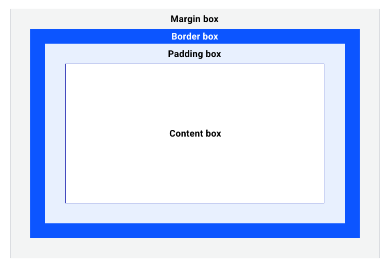
The four main areas are the content box, padding box, border box, and margin box.
The content box is the area where content lives. The content controls the size of this area by default.
The padding box surrounds the content box.
it’s the space created by the padding property.
Because padding is inside the box, the background of the box is visible behind it.
Scrollbars also live in this space if the box has scroll settings.
The border box surrounds the padding box.
Its space is defined by the border property, which creates a visual frame for the element.
The border edge is the limit of what you can see.
The margin box is the space around your box.
it’s defined by the margin property.
Properties like outline and box-shadow occupy this space as well.
They are painted on top of the element and don’t affect the box size.
Changing your outline width won’t shift anything inside the border edge.
Here is a helpful analogy for the box model.
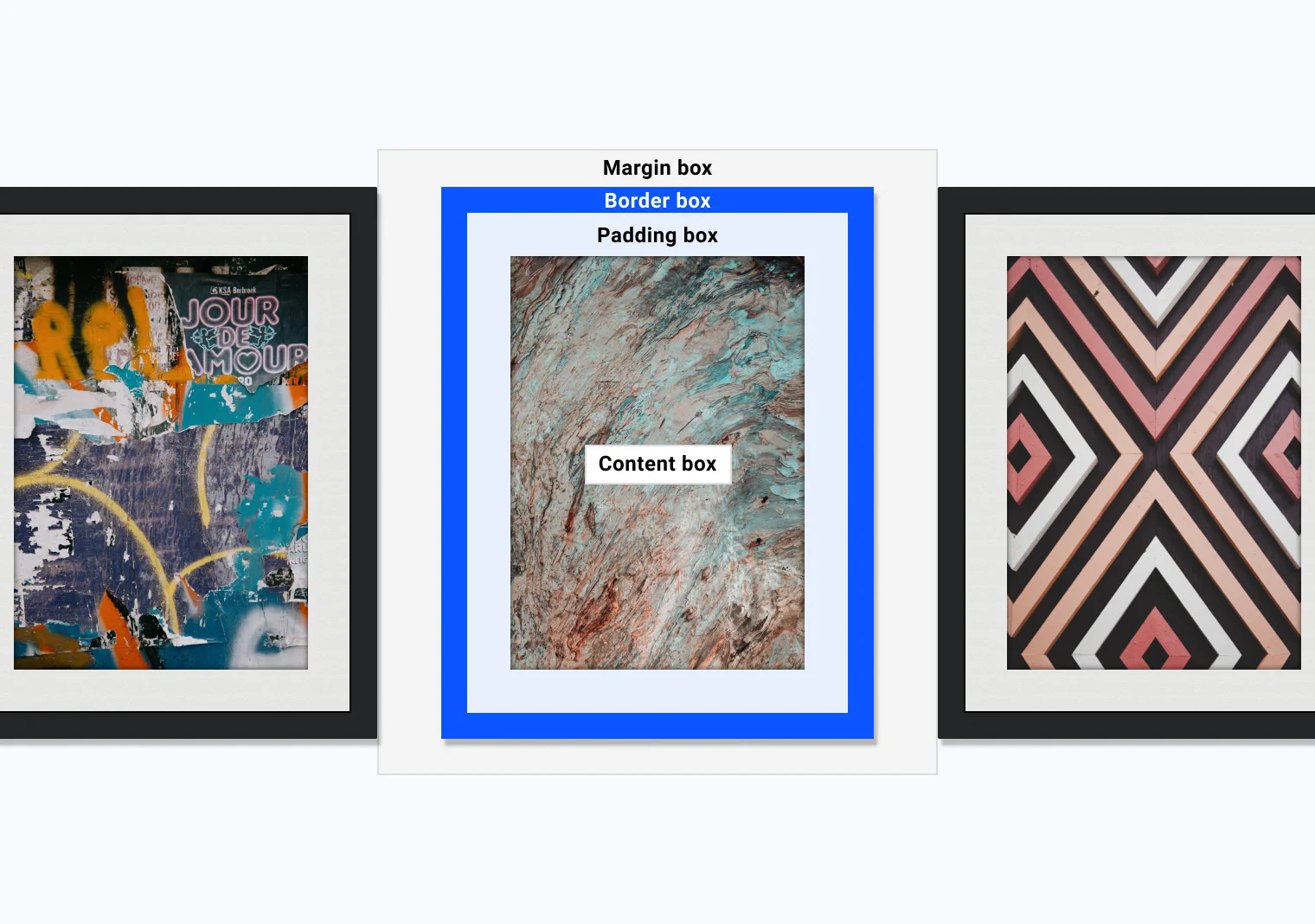
Think of three picture frames mounted next to each other on a wall. We can map them to the box model parts like this.
Browser developer tools show a visualization of the box model. This is the best way to understand how the browser calculates these spaces.
To try this in Chrome, open DevTools, select an element, and show the box model debugger.
To control the box model, you need to understand how the browser works. Every browser applies a default stylesheet to HTML documents. This user agent stylesheet defines default styles and behaviors. The default styles vary slightly by browser, but they all set basic rules to make pages readable.
The user agent stylesheet sets the default display value for elements.
For example, a div defaults to block, a li defaults to list-item, and a span defaults to inline.
An inline element can have block margins, but other elements don’t respect them.
With inline-block, other elements respect those margins, but the element keeps its other inline behaviors.
A block item fills the available inline space by default, while inline and inline-block elements are only as large as their content.
The default stylesheet also sets box-sizing to content-box.
This tells the box to apply width and height dimensions to the content box.
Any padding and border values you set are added on top of that size.
Let us check an example.
.my-box {
  width: 200px;
  border: 10px solid;
  padding: 20px;
}
How wide is .my-box in the browser?
The default box sizing is content-box, so the padding and borders are added to the width.
This makes the total width 260px.
That is 200px for content, plus 40px of padding and 20px of border.
It would be 200px if the box had box-sizing: border-box.
You can change this default by specifying border-box sizing.
.my-box {
  box-sizing: border-box;
  width: 200px;
  border: 10px solid;
  padding: 20px;
}
This alternative box model tells the browser to apply the width to the border box instead of the content box.
It pushes the border and padding inside the 200px width.
When you set .my-box to 200px, it renders at exactly 200px wide.
Compare the two modes in the interactive demo.
Most developers apply border-box to every element.
*,
*::before,
*::after {
  box-sizing: border-box;
}
This rule selects every element and pseudo-element and resets them to the alternative box model. It makes layout sizes much more predictable. You will see this reset in most modern boilerplates.
Adapted from Learn CSS © Google and contributors, licensed under CC BY 4.0 (prose) and Apache 2.0 (code samples).