Title here
Summary here
In the box model module, we used a picture frame to describe each part of the box model.
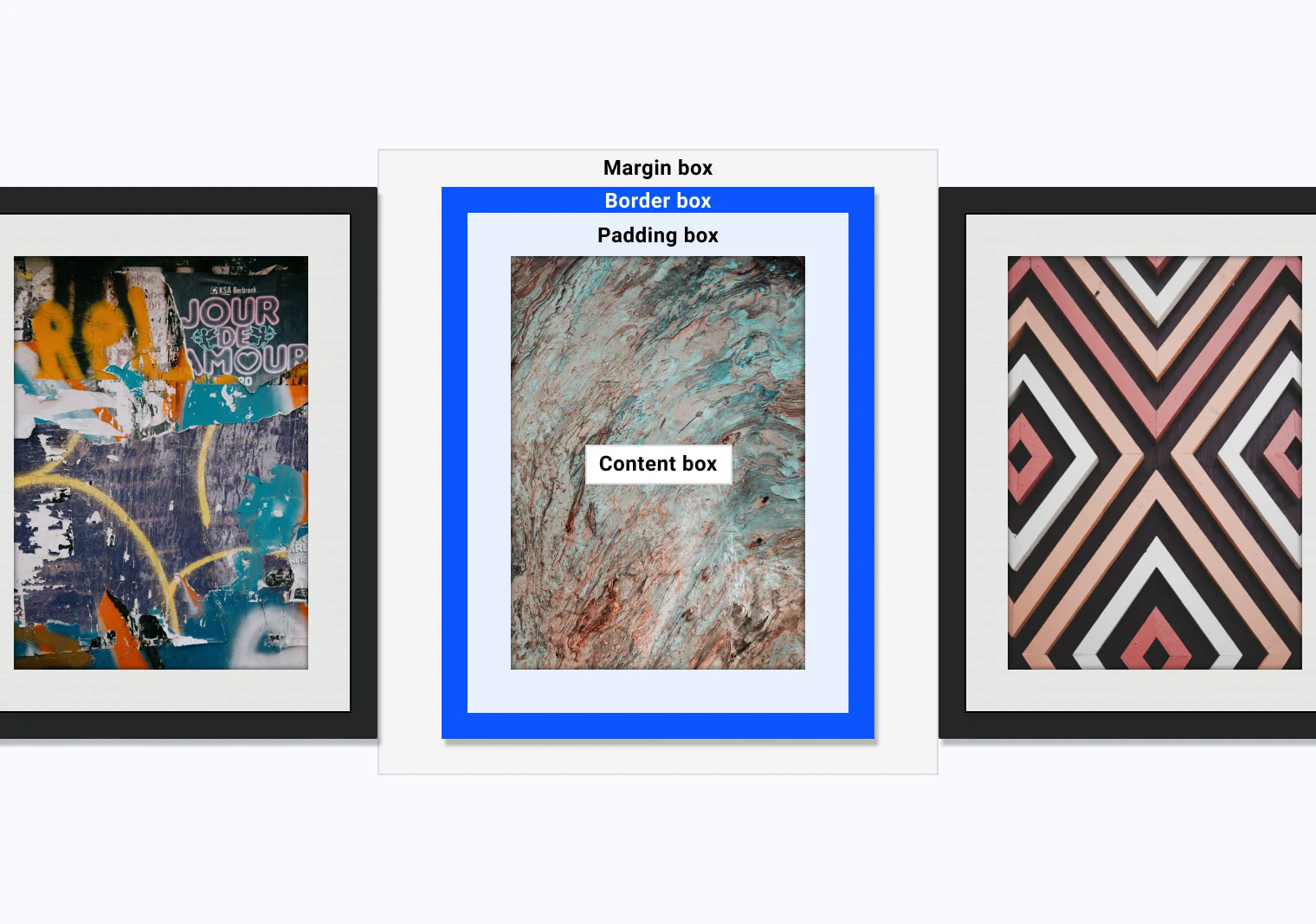
The border box is the frame of your boxes.
The border properties give you a huge range of options to build that frame in nearly any style you can think of.
The individual border properties let you style the different parts of a border.
For a border to show up, you have to set the border-style.
There are a few options to choose from.
When you use the ridge, inset, outset, and groove styles, the browser darkens the second border color to add contrast and depth.
This behavior can change between browsers, especially for dark colors such as black.
In Chrome, these border styles look solid.
In Firefox, they are lightened so the second color can be darker.
Browser behavior can change for other border styles too, so it’s important to test your site in different browsers.
A common example is how each browser draws the dotted and dashed styles.
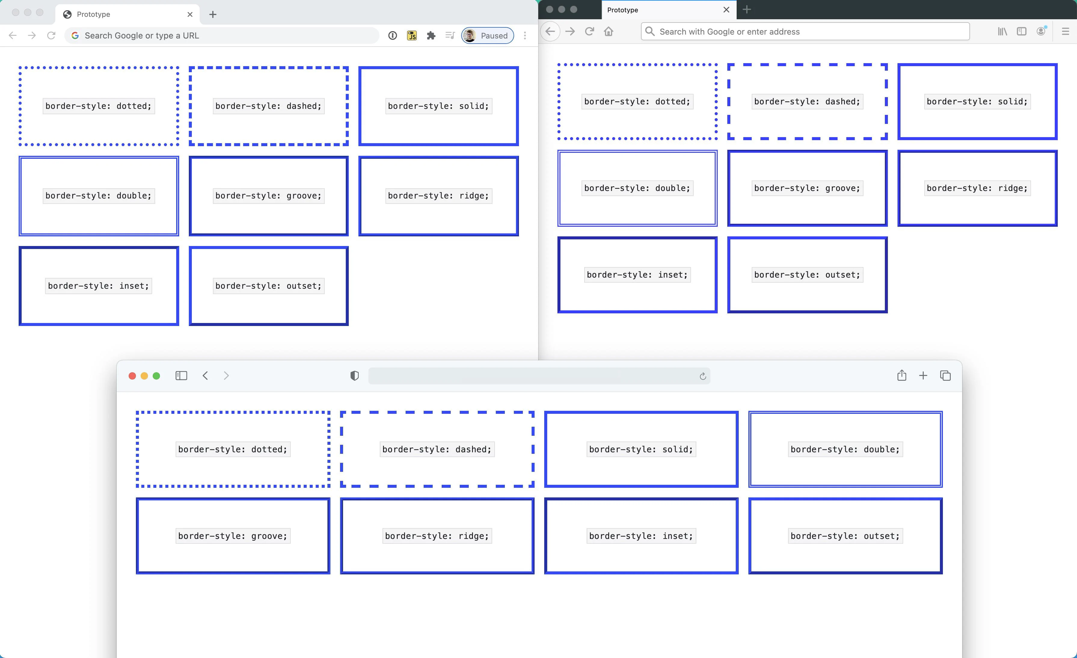
Borders displayed in Chrome, Firefox, and Safari.
To set the border style on each side of your box, you can use border-top-style, border-right-style, border-left-style, and border-bottom-style.
Just like margin and padding, you can use the border shorthand property to set all the parts of your border in one line.
.my-element {
    border: 1px solid red;
}
The order of the values in the border shorthand is border-width, then border-style, then border-color.
You can set the color on all sides of your box, or on each side on its own, with border-color.
By default, it uses the box’s current text color, currentColor.
This means that if you only set border properties like width, the color will be that computed value unless you set it yourself.
.my-element {
    color: blue;
    border: solid; /* Will be a blue border */
}.my-element {
color: blue;
border: solid yellow;
}To set a border color on each side of your box, use border-top-color, border-right-color, border-left-color, and border-bottom-color.
The width of a border is how thick the line is.
You control it with border-width.
The default border width is medium.
This won’t show up unless you also set a style.
You can use other named widths such as thin and thick.
The border-width properties also accept a length unit such as px, em, rem, or %.
To set the border width on each side of your box, use border-top-width, border-right-width, border-left-width, and border-bottom-width.
In the Logical Properties module you learned how to refer to block flow and inline flow, instead of the explicit top, right, bottom, or left sides.
You have this option with borders, too.
.my-element {
    border: 2px dotted;
    border-inline-end: 2px solid red;
}
In this example, .my-element has all sides set to a 2px dotted border in the current text color.
The inline-end border is then set to 2px, solid, and red.
This means that in left to right languages like English, the red border will be on the right side of the box.
In right to left languages like Arabic, the red border will be on the left side of the box.
Browser support is mixed for logical properties in borders, so make sure you check support before you use them.
To give a box rounded corners, use the border-radius property.
.my-element {
    border-radius: 1em;
}
This shorthand adds the same rounding to each corner of your box.
As with the other border properties, you can set the border radius for each corner with border-top-left-radius, border-top-right-radius, border-bottom-right-radius, and border-bottom-left-radius.
You can also set each corner’s radius in the shorthand. The order is top left, top right, bottom right, then bottom left.
.my-element {
    border-radius: 1em 2em 3em 4em;
}
When you set a single value for a corner, you are using another shorthand.
That is because a border radius is split into two parts, the vertical side and the horizontal side.
This means that when you set border-top-left-radius: 1em, you are setting the top-left-top radius and the top-left-left radius.
You can set both parts per corner like this.
.my-element {
    border-top-left-radius: 1em 2em;
}
This sets a border-top-left-top value of 1em and a border-top-left-left value of 2em.
This turns the top left corner into an elliptical radius instead of the default circular one.
You can set these values in the border-radius shorthand by using a / to add the elliptical values after the standard ones.
This lets you get creative and make some complex shapes.
.my-element {
    border: 2px solid;
  border-radius: 95px 155px 148px 103px / 48px 95px 130px 203px;
}You don’t have to use a line-based border in CSS.
You can also use any kind of image with border-image.
This shorthand property lets you set the source image, how that image is sliced, the image width, how far the border sits out from the edge, and how it should repeat.
.my-element {
  border-image-source: url(https://assets.codepen.io/174183/border-image-frame.jpg);
  border-image-slice: 61 58 51 48;
  border-image-width: 20px 20px 20px 20px;
  border-image-outset: 0px 0px 0px 0px;
  border-image-repeat: stretch stretch;
}
The border-image-width property is like border-width.
It’s how you set the width of your border image.
The border-image-outset property lets you set the distance between your border image and the box that it wraps around.
border-image-sourceThe border-image-source is the source of the border image.
It can be a url for any valid image, which includes CSS gradients.
.my-element {
    border-image-source: url('path/to/image.png');
}.my-element {
border-image-source: linear-gradient(to bottom, #000, #fff);
}border-image-sliceThe border-image-slice property is a handy property that lets you slice an image into 9 parts, made up of 4 split lines.
It works like the margin shorthand, where you set the top, right, bottom, and left offset value.
.my-element {
    border-image: url('image.jpg');
    border-image-slice: 61 58 51 48;
}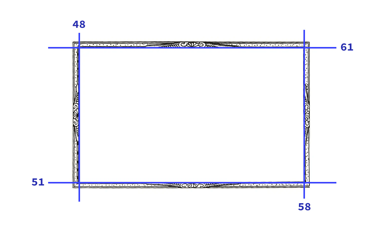
With the offset values set, you now have 9 sections of the image, which are 4 corners, 4 edges, and a middle section.
The corners are applied to the corners of the element with the border image.
The edges are applied to the edges of that element.
The border-image-repeat property sets how those edges fill their space, and the border-image-width property controls the size of the slices.
Last, the fill keyword decides whether the middle section, left behind by the slicing, is used as the element’s background image or not.
border-image-repeatborder-image-repeat is how you tell CSS the way you want your border image to repeat.
It works the same as background-repeat.
The values work in these ways.
stretch, which stretches the source image to fill the available space where possible.repeat value tiles the source image’s edges as many times as possible, and may clip the edge regions to do this.round value is the same as repeat, but instead of clipping the image edge regions to fit as many as possible, it stretches the image as well as repeating it for a seamless repeat.space value is again the same as repeat, but this value adds space between each edge region to create a seamless pattern.Adapted from Learn CSS © Google and contributors, licensed under CC BY 4.0 (prose) and Apache 2.0 (code samples).