Title here
Summary here
Say you have a group of three boxes, stacked on top of each other, and you want space between them. How many ways can you think of to do that in CSS?
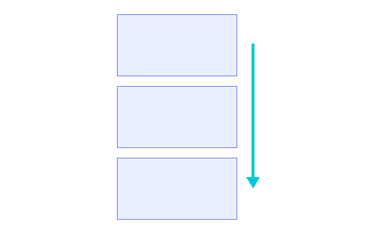
The margin property might give you what you need.
But it might also add extra spacing that you don’t want.
For example, how do you target just the space in between each of those elements?
Something like gap might be a better fit in this case.
There are many ways to adjust spacing in a user interface.
Each one has its own strengths and gotchas.
HTML itself gives you some ways to space elements.
The <br> and <hr> elements space elements in the block direction.
In a latin-based language, the block direction is top to bottom.
If you use a <br> element, it will create a line break.
This is just like pressing the enter key in a word processor.
The <hr> element creates a horizontal line with space on either side.
That space is known as margin.
Along with HTML elements, HTML entities can create space.
An HTML entity is a reserved string of characters that the browser swaps out for a real character.
For example, if you type © in your HTML file, the browser turns it into a © character.
The entity turns into a non-breaking space character, which adds an inline space.
Be careful though.
The non-breaking part of this character stitches the two elements together, which can cause odd behavior.
[!NOTE] Use HTML elements to add space only when the element helps with the understanding of the document. For example, an
<hr>doesn’t just add space, it creates a logical split between two chunks of content. If you just want a line with space around it, adding a border with CSS might be a better fit.
If you want to add space to the outside of an element, you use the margin property.
Margin is like adding a cushion around your element.
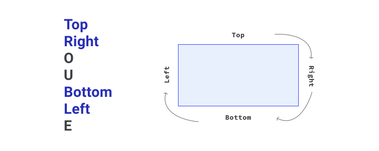
The margin property is shorthand for margin-top, margin-right, margin-bottom, and margin-left.
The margin shorthand applies its values in a set order, which is top, right, bottom, and left.
You can remember these with the word trouble, spelled TRouBLe.
You can also use the margin shorthand with one, two, or three values.
Adding a fourth value lets you set each side on its own.
The values work like this.
margin: 20px.margin: 20px 40px.top, the second value is left and right, and the third value is bottom, like margin: 20px 40px 30px.You can define margin with a length, a percentage, or an auto value, such as 1em or 20%.
If you use a percentage, the value is worked out from the width of your element’s containing block.
So if your element’s containing block has a width of 250px and your element has a margin value of 20%, each side of your element will have a computed margin of 50px.
You can also use a value of auto for margin.
For block level elements with a set size, an auto margin takes up the available space in the direction it is applied to.
A good example is this one from the flexbox module, where the items push away from each other.
Another good example of an auto margin is a horizontally centered wrapper that has a max width.
This sort of wrapper is often used to create a consistent center column on a website.
.wrapper {
    max-width: 400px;
    margin: 0 auto;
}
Here, margin is removed from the top and bottom (block) sides, and auto shares the space between the left and right (inline) sides.
[!NOTE] In the previous module on logical properties, you learned about another way to set margin. Instead of
margin-top,margin-right,margin-bottom, andmargin-left, you can usemargin-block-start,margin-inline-end,margin-block-end, andmargin-inline-start.
You can also use negative values for margin. Instead of adding space between adjacent sibling elements, it will reduce space between them. This can make elements overlap if you set a negative value that is more than the available space.
Margin collapse is a tricky idea, but you will run into it very often when building interfaces. Say you have two elements, a heading and a paragraph, that both have vertical margin on them.
<article>
  <h1>My heading with teal margin</h1>
  <p>A paragraph of text that has blue margin on it, following the heading with margin.</p>
</article>
h1 {
margin-bottom: 2rem;
}
p {
margin-top: 3rem;
}At first glance, you might think the paragraph will sit 5rem from the heading, because 2rem and 3rem add up to 5rem.
But because vertical margin collapses, the space is actually 3rem.
Margin collapse works by picking the largest value of two touching elements with vertical margin on the touching sides.
The bottom of the h1 meets the top of the p.
So the larger of the h1’s bottom margin and the p’s top margin is the one that wins.
If the h1 had 3.5rem of bottom margin, the space between them would be 3.5rem, because that is larger than 3rem.
Only block margins collapse, not inline (horizontal) margins.
[!NOTE] This behavior goes back to when the web was mostly just documents. Collapsing margins help set consistent spacing between elements without creating huge gaps by accident when elements both have margin.
Margin collapse also helps with empty elements.
If you have a paragraph with a top and bottom margin of 20px, it will only create 20px of space, not 40px.
But if anything is added to the inside of this element, including padding, its margin will no longer collapse in on itself.
It will be treated like any box with content.
If you make an element absolutely positioned, using position: absolute, the margin will no longer collapse.
The margin also won’t collapse if you use the float property.
If you have an element with no margin between two elements with block margin, the margin won’t collapse either. This is because the two elements with block margin are no longer adjacent siblings. They are just siblings.
In the layout lesson, you learned that flexbox and grid containers are a lot like block containers, but they handle their child elements very differently. This is the case with margin collapse too.
If we take the original example from the lesson and apply flexbox with column direction, the margins are combined instead of collapsed. This gives you predictable layout work, which is what flexbox and grid containers are built for.
Margin and margin collapse can be tricky to understand. But understanding how they work in detail is very useful, so this detailed explainer is strongly recommended.
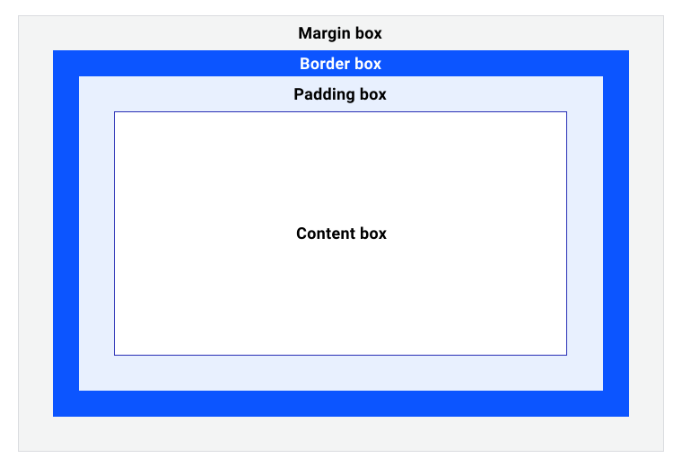
Instead of creating space on the outside of your box, like margin does, the padding property creates space on the inside of your box.
Think of it like insulation.
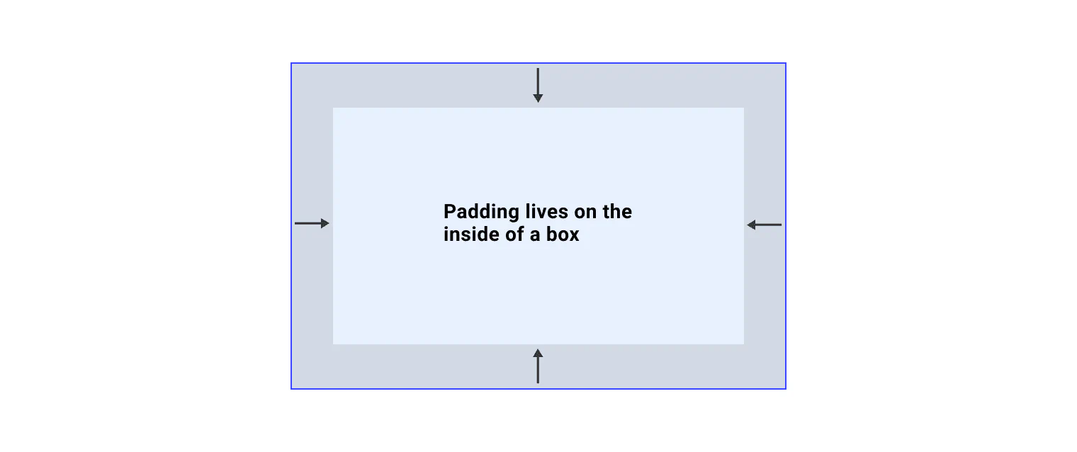
The box model you are using was covered back in the box model lesson.
Depending on which one you use, padding can also change the overall size of the element.
The padding property is shorthand for padding-top, padding-right, padding-bottom, and padding-left.
Just like margin, padding has logical properties too.
They are padding-block-start, padding-inline-end, padding-block-end, and padding-inline-start.
Positioning is also covered in the layout module.
If you set a value for position that is anything other than static, you can space elements with the top, right, bottom, and left properties.
These directional values behave in a few different ways.
position: relative keeps its place in the document flow, even when you set these values. They are also relative to your element’s position.position: absolute bases the directional values on the relative parent’s position.position: fixed bases the directional values on the viewport.position: sticky only applies the directional values when it is in its docked or stuck state.In the logical properties module, you learn about the inset-block and inset-inline properties.
These let you set directional values that honor the writing mode.
Both properties are shorthands that combine the start and end values.
So they accept either one value to set both start and end, or two separate values.
Lastly, in both grid and flexbox, you can use the gap property to create space between child elements.
The gap property is shorthand for row-gap and column-gap.
It accepts one or two values, which can be lengths or percentages.
You can also use keywords such as unset, initial, and inherit.
If you set only one value, the same gap is applied to both the rows and the columns.
If you set both values, the first value is row-gap and the second value is column-gap.
With both flexbox and grid, you can also create space using their distribution and alignment features. We cover these in the grid module and the flexbox module.
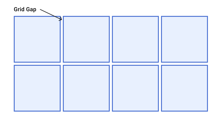
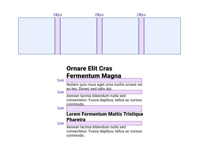
It’s a really good idea to choose a strategy and stick with it. This helps you create a consistent user interface that has good flow and rhythm. A good way to do this is to use consistent measures for your spacing.
For example, you could commit to using 20px as a consistent measure for all gaps between elements.
These gaps are known as gutters.
That way all layouts look and feel consistent.
You could also decide to use 1em as the vertical spacing between flow content.
This would give you consistent spacing based on the element’s font-size.
Whatever you choose, you should save these values as variables, or CSS custom properties.
This turns the values into tokens and makes the consistency a bit easier to keep.
:root {
  --gutter: 20px;
  --spacing: 1em;
}

h1 {
  margin-left: var(--gutter);
  margin-top: var(--spacing);
}
Using custom properties like this lets you define them once, then use them throughout your CSS. When they are updated, either locally within an element or globally, the values pass down through the cascade and the updated values show up everywhere.
Adapted from Learn CSS © Google and contributors, licensed under CC BY 4.0 (prose) and Apache 2.0 (code samples).