Title here
Summary here
A very common interface pattern is a text label with an icon next to it.
The icon sits to the left of the text with a small gap between the two.
That gap comes from margin-right on the icon.
There is a problem though.
This only works when the text direction is left to right.
If the text direction changes to right to left, which is how languages like Arabic read, the icon ends up pressed against the text.
How do you handle this in CSS? Logical properties solve these problems. They give you free, automatic support for other languages, plus other benefits. They help you build a front end that works for more people.
The physical properties of top, right, bottom, and left point to the physical sides of the viewport. You can think of them like the directions on a compass. Logical properties work differently. They point to the edges of a box based on the flow of content. This means they can change when the text direction or writing mode changes. That is a big shift from fixed directions, and it gives you a lot more flexibility when you style your pages.
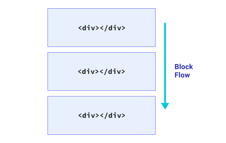
Block flow is the direction blocks of content are placed in.
For example, if there are two paragraphs, the block flow is where the second paragraph goes.
In an English document, the block flow runs top to bottom.
Think of paragraphs of text following each other, top to bottom.
Inline flow is the direction text runs in a sentence.
In an English document, the inline flow runs left to right.
If you change the language of your page to Arabic with <html lang="ar">, then the inline flow runs right to left.
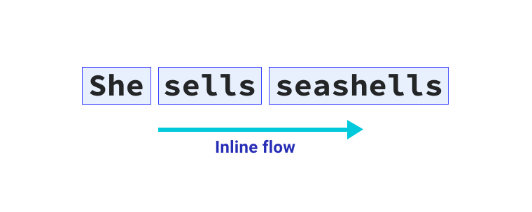
Text flows in the direction set by the document’s writing mode.
You can change the direction text is laid out with the writing-mode property.
You can apply it to the whole document or to single elements.
In the past, CSS only let you apply properties like margin to a fixed side.
For example, margin-top applies to the physical top of the element.
With logical properties, margin-top becomes margin-block-start.
This means the block flow gets the right margin rules no matter the language or text direction.
To stop an element from growing past a certain width or height, write a rule like this.
.my-element {
  max-width: 150px;
  max-height: 100px;
}
The flow relative versions are max-inline-size and max-block-size.
You can also use min-block-size and min-inline-size in place of min-height and min-width.
With logical properties, that max width and height rule looks like this.
.my-element {
  max-inline-size: 150px;
  max-block-size: 100px;
}Instead of directions like top, right, bottom, and left, use start and end. This gives you block-start, inline-end, block-end, and inline-start. These let you write CSS that responds to writing mode changes.
For example, to align text to the right, you could use this CSS.
p {
  text-align: right;
}
If your goal is not the physical right, but the start of the reading direction, this does not help.
Logical values give you start and end, which map to the text direction.
The text alignment rule now looks like this.
p {
  text-align: end;
}Logical properties for margin, padding, and inset make it easier to position elements and control how they sit next to each other across writing modes.
The margin and padding properties still map to directions.
The key difference is that when the writing mode changes, they change with it.
.my-element {
  padding-top: 2em;
  padding-bottom: 2em;
  margin-left: 2em;
  position: relative;
  top: 0.2em;
}
This adds some vertical space inside with padding and pushes the element in from the left with margin.
The top property also shifts it down.
With logical properties, it looks like this instead.
.my-element {
  padding-block-start: 2em;
  padding-block-end: 2em;
  margin-inline-start: 2em;
  position: relative;
  inset-block-start: 0.2em;
}
This adds inline space inside with padding and pushes the element in from the inline-start with margin.
The inset-block property moves it in from the block-start.
The inset-block property is not the only shorthand with logical properties.
You can shorten this rule even more with the shorthand versions of margin and padding.
.my-element {
  padding-block: 2em;
  margin-inline: 2em 0;
  position: relative;
  inset-block: 0.2em 0;
}You can add border and border-radius with logical properties too.
To add a border on the bottom and right, with a radius on the bottom right corner, you might write a rule like this.
.my-element {
  border-bottom: 1px solid red;
  border-right: 1px solid red;
  border-bottom-right-radius: 1em;
}
Or you could use logical properties like this.
.my-element {
  border-block-end: 1px solid red;
  border-inline-end: 1px solid red;
  border-end-end-radius: 1em;
}
The end-end in border-end-end-radius means the block end and the inline end.
Logical properties bring two new units, vi and vb.
A vi unit is 1% of the viewport size in the inline direction.
The non-logical version is vw.
The vb unit is 1% of the viewport in the block direction.
The non-logical version is vh.
These units always map to the reading direction.
For example, say you want an element to take up 80% of the available inline space of a viewport.
Using the vi unit, that size switches to top to bottom on its own if the writing mode is vertical.
Logical properties and writing modes are not just for other languages. You can use them to build a more flexible interface.
If you have a chart with labels on the X axis and Y axis, you might want the Y label to read up and down.
The Y axis label in the demo has a writing-mode of vertical-rl.
Because of that, you can use the same margin values on both labels.
The margin-block-start value applies to both labels because the block start is on the right for the Y axis and on the top for the X axis.
The block-start sides have a red border so you can see them.
Now that you have seen logical properties, you can use what you learned on the design problem from the start.
p {
  display: inline-flex;
  align-items: center;
}

p svg {
  width: 1.2em;
  height: 1.2em;
  margin-right: 0.5em;
  flex: none;
}
The margin is applied to the right of the icon element.
For the gap between the icon and the text to work in every reading direction, use the margin-inline-end property instead.
p {
  display: inline-flex;
  align-items: center;
}

p svg {
  width: 1.2em;
  height: 1.2em;
  margin-inline-end: 0.5em;
  flex: none;
}
Now, no matter the reading direction, the icon places and spaces itself correctly.
Adapted from Learn CSS © Google and contributors, licensed under CC BY 4.0 (prose) and Apache 2.0 (code samples).