Title here
Summary here
A really common layout in web design is a header, sidebar, body, and footer.
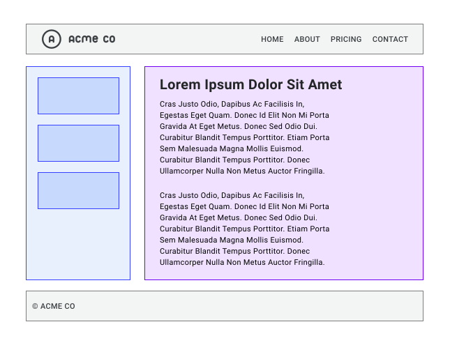
Over the years, there have been many ways to solve this layout. With CSS grid, it is fairly simple, and you have lots of options. Grid lets you mix the control of fixed sizes with the flexibility of content-based sizes. That makes it great for this sort of layout. This is because grid is a layout method built for two-dimensional content. That means it lays things out in rows and columns at the same time.
When you create a grid layout, you define a grid with rows and columns. Then you place items onto that grid, or you let the browser place them into the cells you made. There is a lot to grid, but with an overview of what is available, you will be making grid layouts in no time.
So what can you do with grid? Grid layouts have the features listed here. You will learn about all of them in this guide.
Grid comes with a bunch of new words to learn, since it is the first time CSS has had a real layout system.
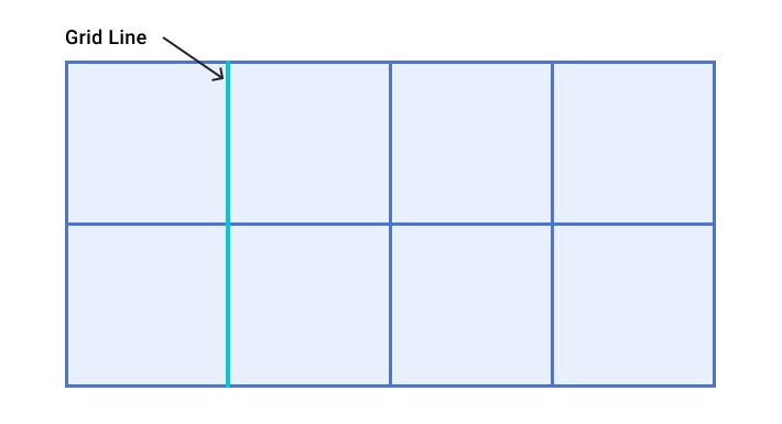
A grid is made up of lines that run across and down. If your grid has four columns, it will have five column lines, counting the one after the last column.
Lines are numbered starting from 1. The numbering follows the writing mode and direction of the component. This means column line 1 will be on the left in a left to right language like English, and on the right in a right to left language like Arabic.
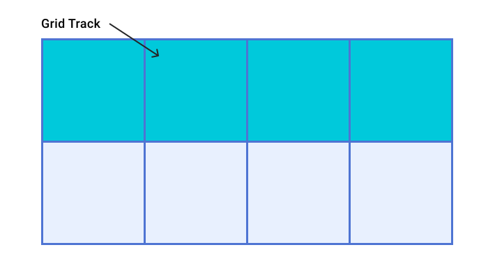
A track is the space between two grid lines. A row track sits between two row lines, and a column track sits between two column lines. When we make our grid, we create these tracks by giving them a size.
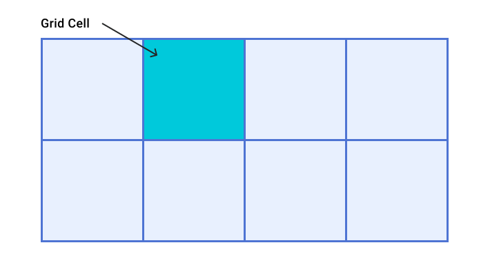
A grid cell is the smallest space on a grid, set by where a row and a column track cross. It is just like a table cell or a cell in a spreadsheet. If you define a grid and don’t place any items, they lay out one item into each grid cell for you.
A grid area is several grid cells together. You create a grid area by making an item span more than one track.
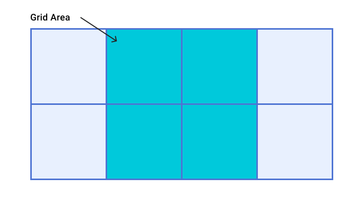
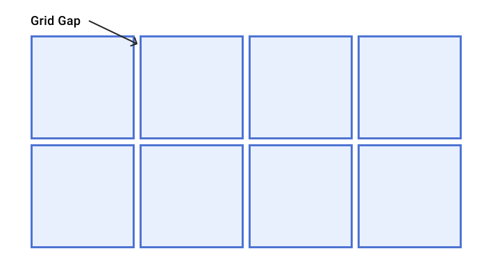
A gap is the space between tracks. For sizing, gaps act like a regular track. You can’t place content into a gap, but you can span grid items across it.
The grid container is the HTML element with display: grid on it.
This creates a new grid context for the direct children.
.container {
  display: grid;
}A grid item is an item that is a direct child of the grid container.
<div class="container">
  <div class="item"></div>
  <div class="item"></div>
  <div class="item"></div>
</div>To make a basic grid, you can define three column tracks, two row tracks, and a 10 pixel gap between the tracks like this.
.container {
    display: grid;
    grid-template-columns: 5em 100px 30%;
    grid-template-rows: 200px auto;
    gap: 10px;
}
This grid shows many of the things from the terminology section. It has three column tracks. Each track uses a different length unit. It has two row tracks, one using a length unit and the other using auto. When you use auto for track sizing, you can think of it as being as big as the content. Tracks are auto sized by default.
If the element with a class of .container has child items, they lay out on this grid right away.
You can see this in the demo below.
The grid overlay in Chrome DevTools can help you see the different parts of the grid.
Open the demo in Chrome.
Inspect the element with the grey background, which has an ID of container.
Highlight the grid by selecting the grid badge in the DOM, next to the .container element.
Inside the Layout tab under Overlay display settings, select Show line numbers in the drop-down to see the line numbers on your grid.
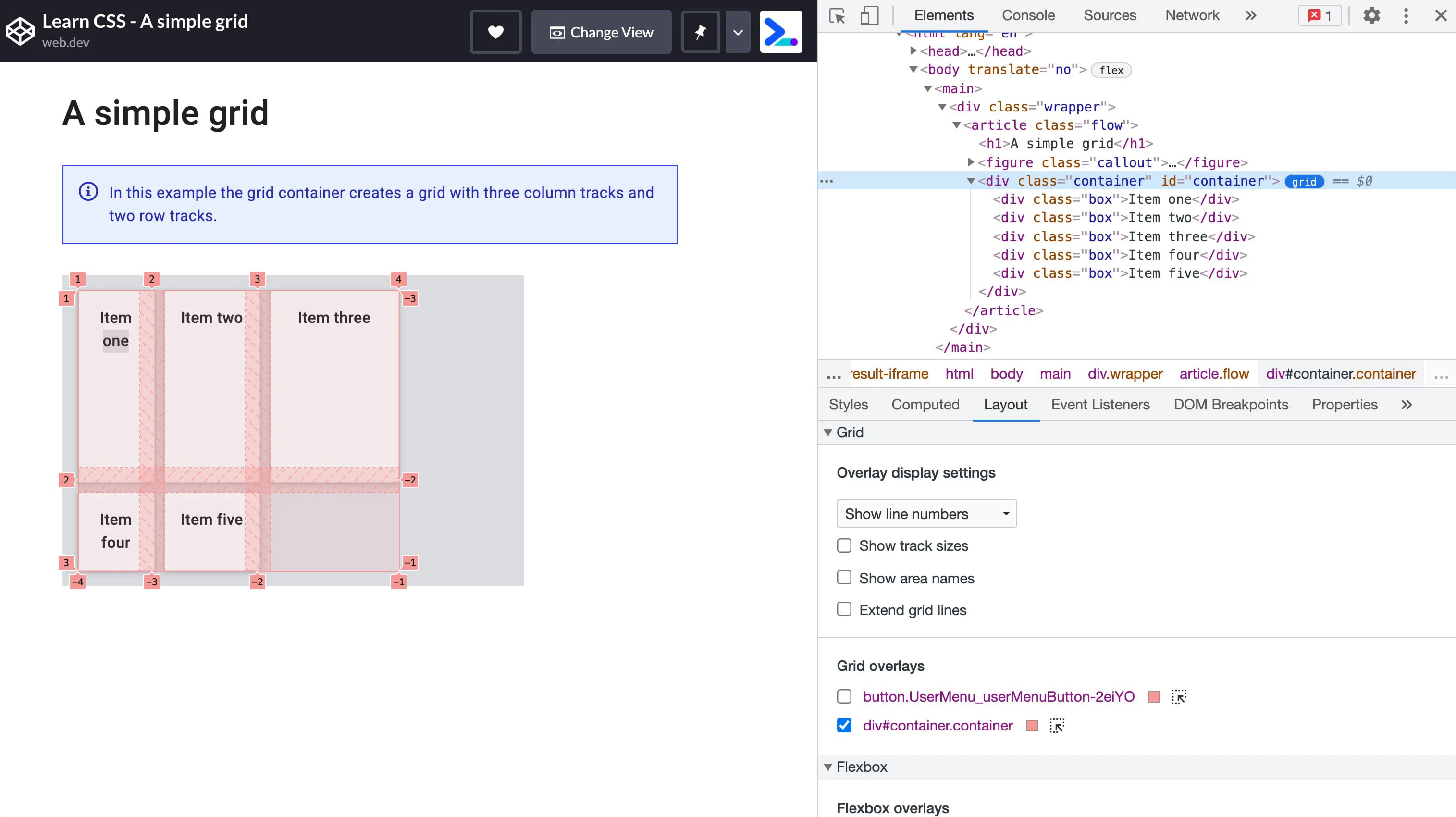 A grid highlighted in Chrome DevTools showing line numbers, cells and tracks.
As well as the length and percentage sizes from the lesson on sizing units, grid tracks can use content-based sizing keywords. These keywords come from the Box Sizing spec and add more ways to size boxes in CSS, not just grid tracks.
min-contentmax-contentfit-content()The min-content keyword makes a track as small as it can be without the content spilling out.
If you change the example grid to have three column tracks all at min-content size, they become as narrow as the longest word in the track.
The max-content keyword does the opposite.
The track becomes wide enough to show all of the content in one long unbroken string.
This might cause the content to spill out, since the string won’t wrap.
The fit-content() function acts like max-content at first.
But once the track reaches the size you pass into the function, the content starts to wrap.
So fit-content(10em) makes a track that is smaller than 10em if the max-content size is less than 10em, but never larger than 10em.
In the next demo, try out the different sizing keywords by changing the size of the grid tracks.
[!NOTE] You might spot in this demo that when auto is used, the grid columns stretch to fill the container. Auto sized tracks stretch by default if there is extra space in the grid container.
fr unitYou already have length sizes, percentages, and these new keywords.
There is also a special way to size tracks that only works in grid layout.
This is the fr unit, a flexible length that describes a share of the available space in the grid container.
The fr unit works in a similar way to using flex: auto in flexbox.
It shares out space after the items are laid out.
So to have three columns that all get the same share of the available space, you can write this.
.container {
  display: grid;
  grid-template-columns: 1fr 1fr 1fr;
}
Because the fr unit shares out available space, you can mix it with a fixed size gap or fixed size tracks.
To have a component with a fixed size element and a second track taking up whatever space is left, you can use a track list of grid-template-columns: 200px 1fr.
Different values for the fr unit share the space in proportion.
Larger values get more of the spare space.
In the demo below, change the value of the third track.
minmax() functionThis function lets you set a minimum and a maximum size for a track.
This can be quite handy.
If we take the earlier example of the fr unit, which shares out the leftover space, it could be written out using minmax() as minmax(auto, 1fr).
Grid looks at the content size first, then shares out the space after giving the content enough room.
This means you might not get tracks that each have an equal share of all the space in the grid container.
To force a track to take an equal share of the space in the grid container minus gaps, use minmax.
Replace 1fr as a track size with minmax(0, 1fr).
This makes the smallest size of the track 0 instead of the min-content size.
Grid then takes all of the space in the container, takes away the space needed for any gaps, and shares the rest out by your fr units.
repeat() notationIf you want to make a 12 column grid with equal columns, you could use this CSS.
.container {
    display: grid;
    grid-template-columns:
      minmax(0,1fr),
      minmax(0,1fr),
      minmax(0,1fr),
      minmax(0,1fr),
      minmax(0,1fr),
      minmax(0,1fr),
      minmax(0,1fr),
      minmax(0,1fr),
      minmax(0,1fr),
      minmax(0,1fr),
      minmax(0,1fr),
      minmax(0,1fr);
}
Or you could write it out using repeat().
.container {
    display: grid;
    grid-template-columns: repeat(12, minmax(0,1fr));
}
You can use the repeat() function to repeat any part of your track list.
For example, you can repeat a pattern of tracks.
You can also have some plain tracks and a repeating part.
.container {
    display: grid;
    grid-template-columns: 200px repeat(2, 1fr 2fr) 200px; /*creates 6 tracks*/
}
auto-fill and auto-fitYou can mix everything you have learned about track sizing, minmax(), and repeat to make a handy pattern with grid layout.
Maybe you don’t want to say how many column tracks there are, but instead want to make as many as will fit in your container.
You can do this with repeat() and the auto-fill or auto-fit keywords.
In the demo below, grid makes as many 200 pixel tracks as will fit in the container.
Open the demo in a new window and see how the grid changes as you change the size of the viewport.
In the demo, we get as many tracks as will fit.
The tracks are not flexible though.
You get a gap on the end until there is enough room for another 200 pixel track.
If you add the minmax() function, you can ask for as many tracks as will fit with a smallest size of 200 pixels and a largest size of 1fr.
Grid then lays out the 200 pixel tracks, and whatever space is left over is shared out equally to them.
This makes a two-dimensional responsive layout with no need for any media queries.
There is a small difference between auto-fill and auto-fit.
In the next demo, play with a grid layout using the syntax from above, but with only two grid items in the grid container.
With the auto-fill keyword, you can see that empty tracks are made.
Change the keyword to auto-fit and the tracks shrink down to 0 size.
This means the flexible tracks now grow to fill the space.
The auto-fill and auto-fit keywords act the same way in every other way.
There is no difference between them once the first track is filled.
You have already seen grid auto-placement at work in the demos so far. Items are placed on the grid one per cell, in the order they appear in the source. For many layouts, this might be all you need. If you need more control, there are a couple of things you might like to do. The first is to tweak the auto-placement layout.
By default, grid layout places items along the rows.
You can instead place the items into columns using grid-auto-flow: column.
You need to define row tracks, or the items will make their own column tracks and lay out all in one long row.
These values relate to the writing mode of the document.
A row always runs in the direction a sentence runs in the writing mode of the document or component.
In the next demo, you can change the value of grid-auto-flow and the writing-mode property.
You can make some or all of the items in an auto-placed layout span more than one track.
Use the span keyword plus the number of lines to span as a value for grid-column-end or grid-row-end.
.item {
    grid-column-end: span 2; /* will span two lines, therefore covering two tracks */
}
Since you haven’t set a grid-column-start, this uses the starting value of auto and is placed by the auto-placement rules.
You can also say the same thing using the shorthand grid-column.
.item {
    grid-column: auto / span 2;
}An auto-placed layout with some items spanning more than one track may leave a grid with some empty cells.
By default, grid layout with a fully auto-placed layout always moves forward.
The items are placed in the order they are in the source, or in any order you set with the order property.
If there is not enough room to fit an item, grid leaves a gap and moves to the next track.
The next demo shows this.
The checkbox turns on the dense packing mode.
You turn this on by giving grid-auto-flow a value of dense.
With this value in place, grid takes items later in the layout and uses them to fill gaps.
This may mean the display no longer matches the order of the content.
You have a lot of features from CSS grid already. Now let’s look at how to position items on the grid we made.
The first thing to remember is that CSS grid layout is based on a grid of numbered lines. The simplest way to place things onto the grid is to place them from one line to another. You will find other ways of placing items in this guide, but you always have those numbered lines.
You can use these properties to place items by line number.
They have shorthands that let you set both start and end lines at once.
To place your item, set the start and end lines of the grid area it should go into.
.container {
    display: grid;
    grid-template-columns: repeat(4, 1fr);
    grid-template-rows: repeat(2, 200px 100px);
}

.item {
    grid-column-start: 1; /* start at column line 1 */
    grid-column-end: 4; /* end at column line 4 */
    grid-row-start: 2; /*start at row line 2 */
    grid-row-end: 4; /* end at row line 4 */
}
Chrome DevTools can give you a visual guide to the lines so you can check where your item is placed.
The line numbering follows the writing mode and direction of the component. In the next demo, change the writing mode or direction to see how the placement of the items stays in line with the way the text flows.
With line-based placement, you can place items into the same cell of the grid.
This means you can stack items, or make one item partly overlap another.
Items that come later in the source show on top of items that come earlier.
You can change this stacking order with z-index, just like with positioned items.
When you make a grid using grid-template-rows and grid-template-columns, you make what is called the explicit grid.
This is a grid that you have defined and given track sizes to.
Sometimes you will have items that show up outside this explicit grid.
For example, you might define column tracks and then add several rows of grid items without ever defining row tracks.
Those tracks would be auto sized by default.
You also might place an item using grid-column-end that is outside the explicit grid you defined.
In both of these cases, grid makes tracks to make the layout work, and these tracks are called the implicit grid.
Most of the time it makes no difference if you are working with an implicit or explicit grid. But with line-based placement, you may run into the main difference between the two.
With negative line numbers, you can place items from the end line of the explicit grid.
This can be handy if you want an item to span from the first to the last column line.
In that case, you can use grid-column: 1 / -1.
The item stretches right across the explicit grid.
This only works for the explicit grid though. Take a layout of three rows of auto-placed items where you want the very first item to span to the end line of the grid.
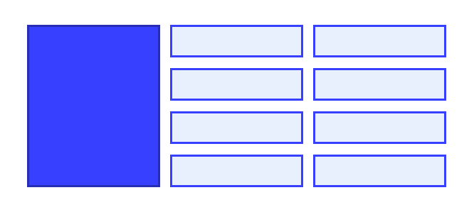
You might think you can give that item grid-row: 1 / -1.
In the demo below, you can see that this doesn’t work.
The tracks are made in the implicit grid, so there is no way to reach the end of the grid using -1.
The tracks made in the implicit grid are auto sized by default.
But if you want to control the size of the rows, use the grid-auto-rows property, and for columns use grid-auto-columns.
Here is how to make all implicit rows with a smallest size of 10em and a largest size of auto.
.container {
    display: grid;
    grid-auto-rows: minmax(10em, auto);
}
Here is how to make implicit columns with a pattern of 100px and 200px wide tracks. In this case, the first implicit column will be 100px, the second 200px, the third 100px, and so on.
.container {
    display: grid;
    grid-auto-columns: 100px 200px;
}It can be easier to place items into a layout if the lines have a name rather than a number. You can name any line on your grid by adding a name of your choosing between square brackets. You can add more than one name, with a space between them inside the same brackets. Once you have named lines, you can use them instead of the numbers.
.container {
    display: grid;
    grid-template-columns:
      [main-start aside-start] 1fr
      [aside-end content-start] 2fr
      [content-end main-end]; /* a two column layout */
}

.sidebar {
    grid-column: aside-start / aside-end;
    /* placed between line 1 and 2*/
}

footer {
    grid-column: main-start / main-end;
    /* right across the layout from line 1 to line 3*/
}You can also name areas of the grid and place items onto those named areas. This is a lovely way to work, since it lets you see what your component looks like right there in the CSS.
To start, give the direct children of your grid container a name using the grid-area property.
header {
    grid-area: header;
}

.sidebar {
    grid-area: sidebar;
}

.content {
    grid-area: content;
}

footer {
    grid-area: footer;
}
The name can be anything you like, other than the keywords auto and span.
Once all of your items are named, use the grid-template-areas property to set which grid cells each item will span.
Each row is set within quotes.
.container {
    display: grid;
    grid-template-columns: repeat(4,1fr);
    grid-template-areas:
        "header header header header"
        "sidebar content content content"
        "sidebar footer footer footer";
}
There are a few rules when using grid-template-areas.
If you break any of these rules, the value is treated as invalid and thrown away.
To leave whitespace on the grid, use a . or several of them with no space between them.
For example, to leave the very first cell on the grid empty, I could add a run of . characters.
.container {
    display: grid;
    grid-template-columns: repeat(4,1fr);
    grid-template-areas:
        "....... header header header"
        "sidebar content content content"
        "sidebar footer footer footer";
}
Since your whole layout is set in one place, it is simple to change the layout using media queries.
In the next example, I made a two column layout that moves to three columns by changing the value of grid-template-columns and grid-template-areas.
Open the example in a new window to play with the viewport size and see the layout change.
You can also see how the grid-template-areas property relates to writing-mode and direction, just like other grid methods.
There are two shorthand properties that let you set many of the grid properties at once. These can look a little confusing until you break down how they fit together. Whether you want to use them or prefer the longer forms is up to you.
grid-templateThe grid-template property is a shorthand for grid-template-rows, grid-template-columns, and grid-template-areas.
The rows are set first, along with the value of grid-template-areas.
Column sizing is added after a /.
.container {
    display: grid;
    grid-template:
      "head head head" minmax(150px, auto)
      "sidebar content content" auto
      "sidebar footer footer" auto / 1fr 1fr 1fr;
}
grid propertyYou can use the grid shorthand in the same way as the grid-template shorthand.
When you use it this way, it resets the other grid properties it accepts back to their starting values.
The full set is listed here.
grid-template-rowsgrid-template-columnsgrid-template-areasgrid-auto-rowsgrid-auto-columnsgrid-auto-flowYou can also use this shorthand to set how the implicit grid behaves, like this.
.container {
    display: grid;
    grid: repeat(2, 80px) / auto-flow  120px;
}Any grid item can also become its own grid container by adding display: grid.
By default, this nested grid has its own track sizing, separate from the parent grid.
With subgrid, your child grid container takes on the track sizing, line names, and gap from the parent grid.
This makes it easier to line up items by sharing the same grid lines.
To use the parent’s grid columns on a nested grid, set grid-template-columns: subgrid.
To use the parent’s grid rows on a nested grid, set grid-template-rows: subgrid.
You can also use subgrid for both rows and columns.
In the demo below, there is a grid with a class of gallery that has a few flexible columns.
Since it doesn’t have a grid-template-rows value, the row sizing comes from the content.
The grid items in the gallery are also grid containers, set to start at the next free row (auto) and span two tracks.
Last, subgrid is used for the grid-template-rows property, which lets the separate gallery-item grids share the same grid track sizing.
If you comment out this line, you will see how the captions are no longer lined up.
When you apply subgrid to both row and column, the subgrid uses the parent’s grid tracks in both directions. In the code below, there is an explicit grid with four columns and four rows with different track sizes.
.container {
  display: grid;
  gap: 1em;
  grid-template-columns: auto 2fr 1fr auto;
  grid-template-rows: 5fr 1fr 2fr 1fr;
}
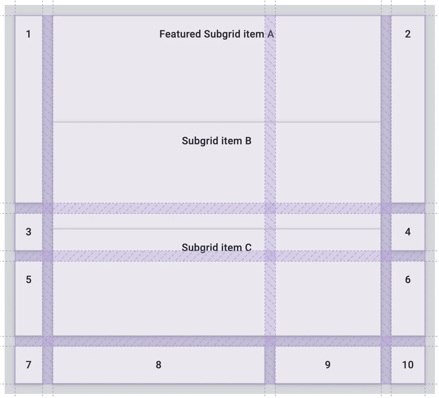
One of the grid items also has display: grid and is set to span two columns and three rows of the parent grid.
Before the subgrid value is added, the items in the nested grid don’t line up with the grid items in the parent grid.
.subgrid-container {
  display: grid;
  grid-column: auto / span 2;
  grid-row: auto / span 3;
}
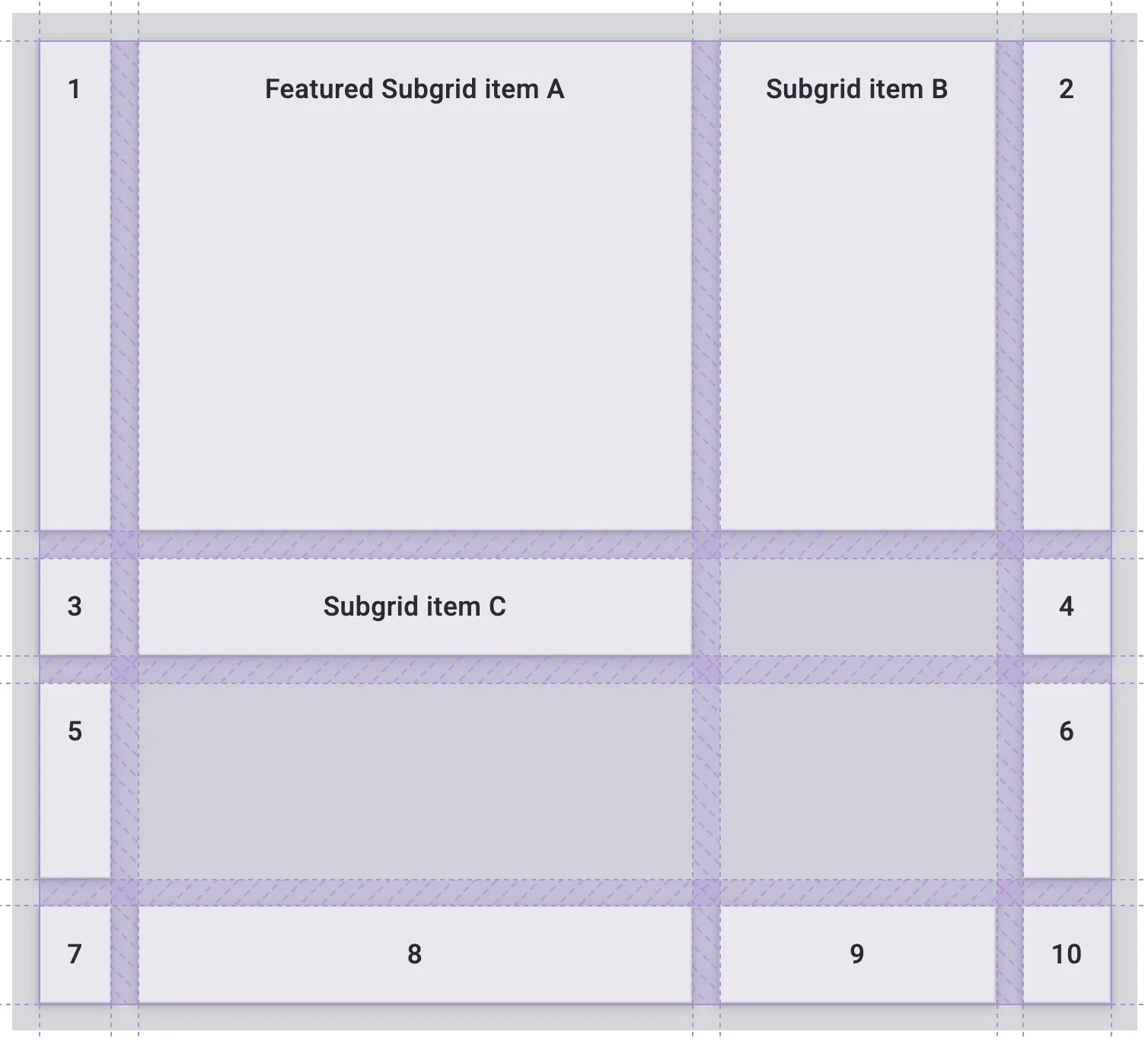
Once subgrid is applied, the grid items in the subgrid take on the gap set on the parent grid and flow their grid items using the columns and tracks of the parent grid.
.subgrid-container {
  display: grid;
  grid-column: auto / span 2;
  grid-row: auto / span 3;
  grid-template-columns: subgrid;
  grid-template-rows: subgrid;
}
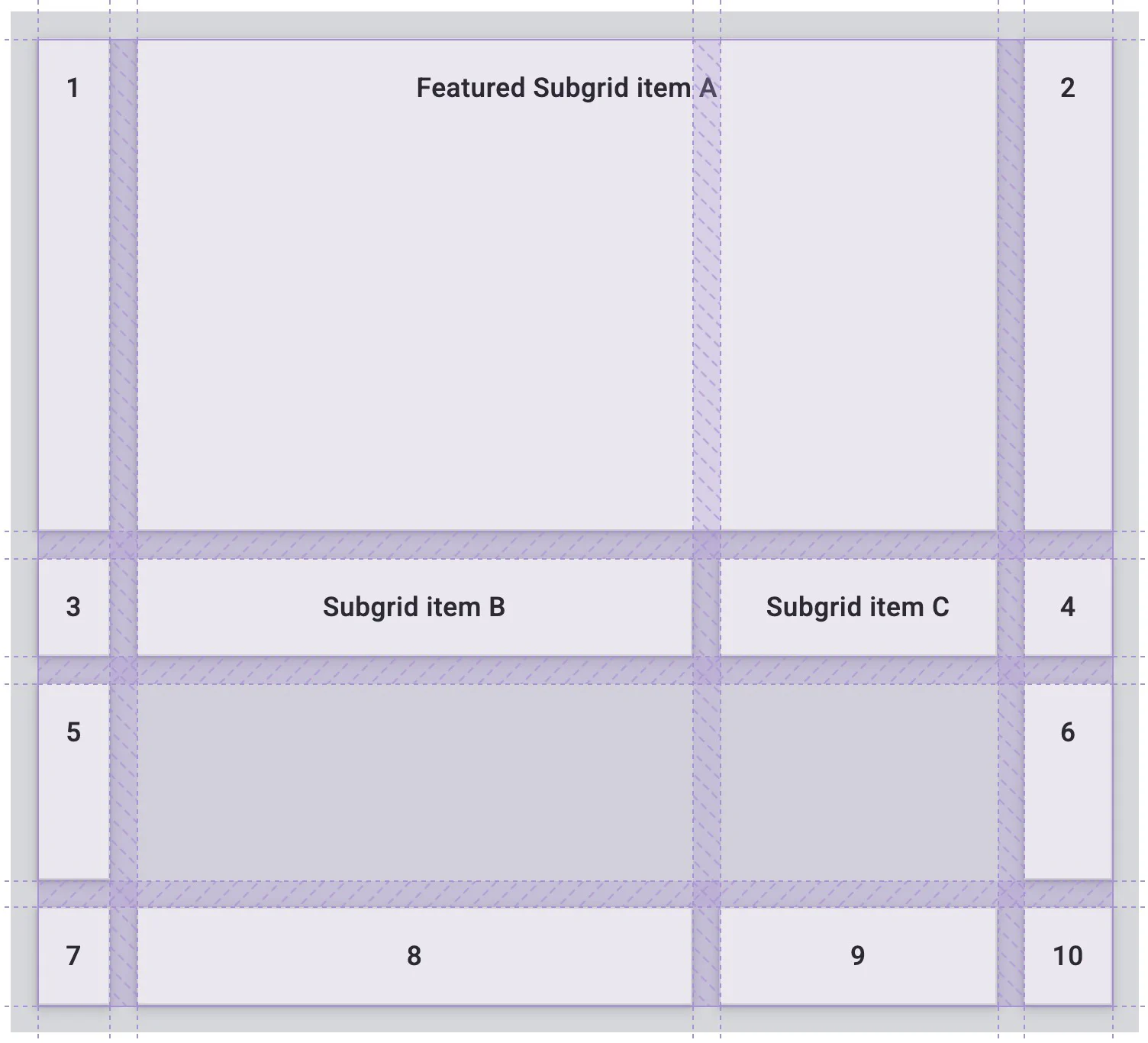
In the subgrid, you can use the same properties and values for any grid item. For example, you can stretch a grid item in the subgrid to take up two grid columns.
.featured-subgrid-item {
  grid-column: span 2;
}
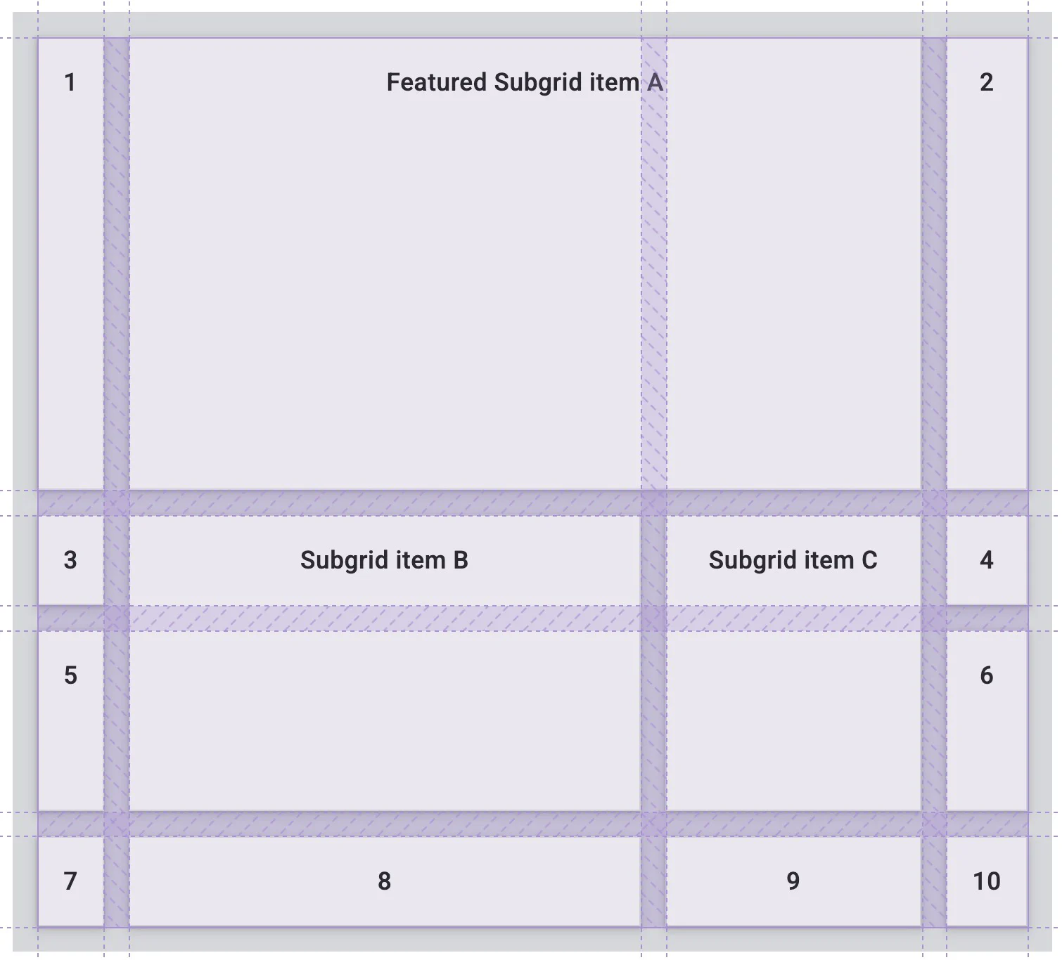
This also works for grid rows.
.subgrid-item {
  grid-row: span 2;
}
Here is the CodePen demo using subgrid in both directions.
[!NOTE] Subgrid can help when you don’t have full control over the markup, or you have to use an extra wrapping container that you did not plan for. You can use
display: contents;in some cases to remove the extra wrapper, but it isn’t always the best option. It also has accessibility issues when used on items that have meaning.
Grid layout uses the same alignment properties you learned about in the lesson on flexbox.
In grid, the properties that begin with justify- are always used on the inline axis, the direction sentences run in your writing mode.
The properties that begin with align- are used on the block axis, the direction blocks are laid out in your writing mode.
justify-content and align-content share out extra space in the grid container around or between tracks.justify-self and align-self go on a grid item to move it around inside the grid area it is placed in.justify-items and align-items go on the grid container to set all of the justify-self properties on the items.In this demo, the grid is larger than the space needed to lay out the fixed width tracks.
This means we have space in both the inline and block directions of the grid.
Try different values of align-content and justify-content to see how the tracks behave.
Notice how the gaps get larger when you use values such as space-between.
Any grid item spanning two tracks also grows to take in the extra space added to the gap.
[!NOTE] Just like flexbox, these properties only work if there is extra space to share out. If your grid tracks neatly fill the container, there is no space to share.
Items with a background color look like they fill the whole grid area they are placed in.
This is because the starting value for justify-self and align-self is stretch.
[!NOTE] If your item is an image, or something else with a built-in aspect ratio, the starting value is
startrather thanstretch. This keeps things from being stretched out of shape.
In the demo, change the values of justify-items and align-items to see how this changes the layout.
The grid area does not change size.
Instead, the items move around inside the area you defined.
This guide has given you an overview of the different parts of grid layout. To find out more, take a look at these resources.
Adapted from Learn CSS © Google and contributors, licensed under CC BY 4.0 (prose) and Apache 2.0 (code samples).