Title here
Summary here
A tricky layout in responsive design is a sidebar that sits next to some content. When there is plenty of room, this works great. When space gets tight, that rigid layout starts to break.
The Flexible Box Layout model, or flexbox, is built for content in one direction. It takes a group of items with different sizes and finds the best layout for them.
This is the perfect tool for the sidebar pattern. Flexbox lays the sidebar and content out side by side. When there is not enough room, the sidebar drops onto a new line. Instead of giving the browser rigid sizes, you give it flexible limits and let it fit the content.
Flex layouts have a handful of features you will explore in this lesson.
The key to flexbox is understanding two directions, the main axis and the cross axis.
The main axis is set by the flex-direction property.
If flex-direction is row, the main axis runs along the row.
If it is column, the main axis runs down the column.
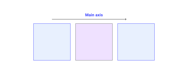
Flex items move as a group along the main axis. Remember, we have a bunch of things and we are trying to lay them out together.
The cross axis runs at a right angle to the main axis.
So if flex-direction is row, the cross axis runs down the column.
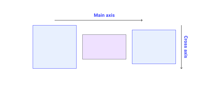
You can do two things on the cross axis.
You can move the items, one at a time or as a group, so they line up against each other and the container.
If your items wrap onto more lines, you can also control how space is shared between those lines.
You will see all of this in action later.
For now, just remember that the main axis follows your flex-direction.
Let’s see flexbox in action. We will take a group of items with different sizes and lay them out.
<div class="container" id="container">
  <div>One</div>
  <div>Item two</div>
  <div>The item we will refer to as three</div>
</div>
To use flexbox, you tell the browser to switch from regular layout to flex layout.
Do this by setting the display property to flex.
.container {
  display: flex;
}
As you saw in the layout lesson, this gives you a block-level box with flex item children. The children start behaving like flex items right away, using their starting values.
[!NOTE] Every CSS property has a starting value that controls how it behaves before you change anything. The children become flex items as soon as the parent gets
display: flex. Those starting values are why you see flexbox behavior without writing any more CSS.
The starting values mean a few things.
Even though you haven’t set flex-direction yet, the items sit in a row.
That is because the starting value of flex-direction is row.
If you want a row, you don’t need to add the property.
To change the direction, add it with one of four values.
row lays the items out in a row.row-reverse lays the items out in a row, starting from the end.column stacks the items in a column.column-reverse stacks the items in a column, starting from the end.Try out the values with our group of items in the demo below.
Be careful with any property that changes the visual order away from the HTML order.
It can hurt accessibility.
The row-reverse and column-reverse values are a good example.
They only change the visual order, not the real order.
This matters because a screen reader reads the content in the real order, and so does anyone moving through the page with a keyboard.
In a reversed row, tabbing between links jumps around. The keyboard follows the HTML, not what you see on screen.
Anything that changes the order of items in flexbox or grid can cause this. So test any reordering carefully to make sure it doesn’t make your site hard to use.
For more, see these articles.
Flex items sit in a row by default. A row runs in the direction that sentences flow for your writing mode and script. So if you work in Arabic, which reads right to left, the items line up on the right. The tab order also starts on the right, the way Arabic is read.
If you use a vertical writing mode, like some Japanese type, a row runs from top to bottom.
Try changing the flex-direction in this demo, which uses a vertical writing mode.
So the default behavior of flex items is tied to the writing mode of the document. Most tutorials use English, or another left to right mode. That makes it easy to assume flex items always start on the left and run across the page.
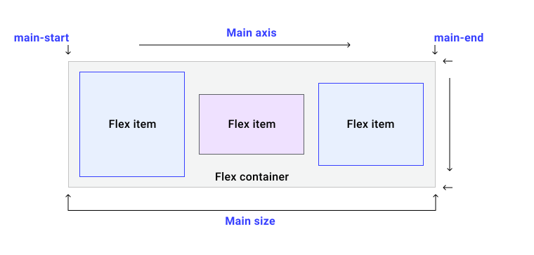
With the main axis, the cross axis, and the writing mode to think about, it makes sense that flexbox talks about start and end instead of top, bottom, left, and right. Each axis has a start and an end. The start of the main axis is called main-start, so the items line up from main-start. The end is main-end. The start of the cross axis is cross-start and the end is cross-end.
The starting value of the flex-wrap property is nowrap.
This means that if there is not enough room, the items overflow the container instead of wrapping.
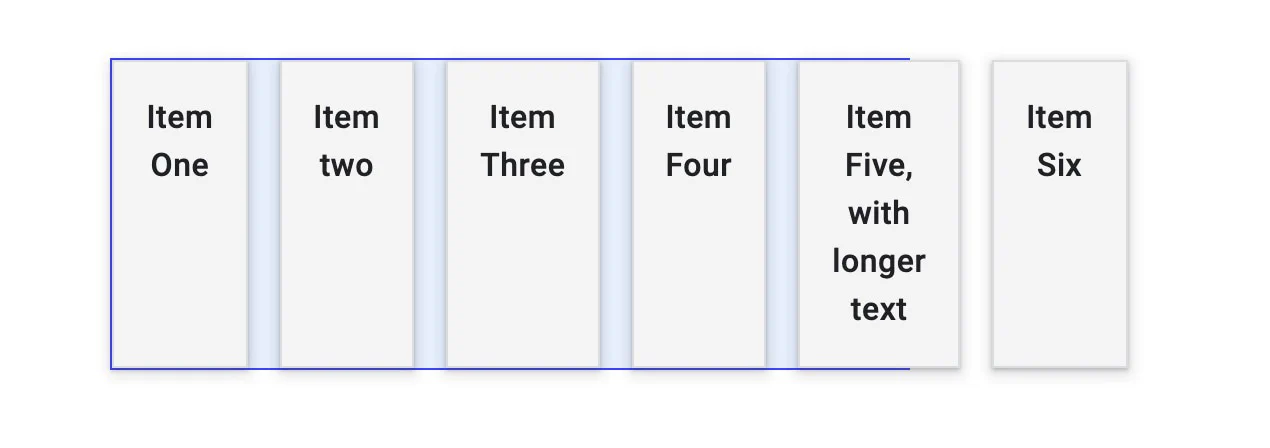 With the starting values, items shrink as small as they can before they overflow.
Items shrink down to the smallest size that still fits their content, then they start to spill out.
To make the items wrap, add flex-wrap: wrap to the container.
.container {
  display: flex;
  flex-wrap: wrap;
}
When a flex container wraps, it creates more flex lines. Each line acts like its own flex container when it comes to sharing space. So if you wrap rows, you can’t line an item up in row two with one above it in row one. This is what people mean when they call flexbox one-dimensional. You control alignment in one direction, a row or a column, not both at once like you can in grid.
You can set flex-direction and flex-wrap together with the flex-flow shorthand.
For example, here is how to set the direction to column and let items wrap.
.container {
  display: flex;
  flex-flow: column wrap;
}Say the container has more room than the items need. The items line up at the start and don’t grow to fill the space. They stop growing at their natural size. This happens because the starting values of the flex properties are set this way.
flex-grow: 0 so items don’t grow.flex-shrink: 1 so items can shrink below their flex-basis.flex-basis: auto so items start at a base size of auto.The flex-basis is the size an item starts at before it grows or shrinks.
You can write all three of these at once with the keyword flex: initial.
The flex shorthand, or the flex-grow, flex-shrink, and flex-basis properties on their own, go on the children of the flex container.
To make the items grow, while letting bigger items take more room than smaller ones, use flex: auto.
Try it in the demo above.
This sets the properties this way.
flex-grow: 1 so items can grow past their flex-basis.flex-shrink: 1 so items can shrink below their flex-basis.flex-basis: auto so items start at a base size of auto.With flex: auto, the items end up different sizes.
The spare space is shared out after each item is laid out at its natural size, so a bigger item gains more room.
To make every item the same size and ignore the content size, change flex: auto to flex: 1 in the demo.
This unpacks to a different set of values.
flex-grow: 1 so items can grow past their flex-basis.flex-shrink: 1 so items can shrink below their flex-basis.flex-basis: 0 so items start at a base size of 0.With flex: 1, every item starts at zero size, so all the space in the container is up for grabs.
Since each item has a flex-grow of 1, they all grow the same amount and share the space evenly.
[!NOTE] There is also
flex: none, which gives you items that don’t grow or shrink. This is handy if you want flexbox just for its alignment, with no flexible sizing.
You don’t have to give every item the same flex-grow.
You can give them different values.
In the demo below, the first item has flex: 1, the second flex: 2, and the third flex: 3.
As the items grow from 0, the spare space is split into six parts.
The first item gets one part, the second gets two, and the third gets three.
You can do the same thing starting from a flex-basis of auto, but you have to write all three values.
The first is flex-grow, the second is flex-shrink, and the third is flex-basis.
.item1 {
  flex: 1 1 auto;
}

.item2 {
  flex: 2 1 auto;
}
This is less common.
The point of a flex-basis of auto is to let the browser work out the spacing.
It can still help when you want one item to grow a little more than the browser would choose.
You can reorder items with the order property.
Items are laid out in the direction set by flex-direction, lowest value first.
If two items share the same value, they show up together in their HTML order.
The example below shows this in action.
[!WARNING] Using
orderhas the same problem asrow-reverseandcolumn-reverse. It is easy to create a confusing experience for some users. Don’t reach fororderto patch content that is out of order in the HTML. If the items should be in a different order, change your HTML.
Flexbox came with a set of properties for lining items up and sharing out space. These turned out to be so useful that they moved into their own spec, and you will meet them in grid too. Here is how they work in flexbox.
The properties fall into two groups, space distribution and alignment. The space distribution properties are listed here.
justify-content shares space on the main axis.align-content shares space on the cross axis.place-content is a shorthand for both.The alignment properties in flexbox are listed here.
align-self lines up a single item on the cross axis.align-items lines up all the items as a group on the cross axis.On the main axis, the properties start with justify-.
On the cross axis, they start with align-.
With the row layout from earlier, there is spare space on the main axis.
The items aren’t big enough to fill the container.
They line up at the start because the starting value of justify-content is flex-start, and the spare space ends up at the end.
Add the justify-content property to the container and give it flex-end.
Now the items line up at the end and the spare space moves to the start.
.container {
  display: flex;
  justify-content: flex-end;
}
You can also spread the space between the items with justify-content: space-between.
Try some of the values in the demo, and see MDN for the full set.
[!NOTE] For
justify-contentto do anything, you need spare space on the main axis. If the items already fill the axis, there is no space to share and nothing happens.
flex-direction: columnIf you change flex-direction to column, then justify-content works down the column.
To have spare space in a column, give the container a height or block-size.
Otherwise there is no extra space to share.
Try the different values again, this time with a column layout.
When a flex container wraps, you might have spare space on the cross axis.
You can share it out with the align-content property, using the same values as justify-content.
There is one difference.
justify-content lines items up at flex-start by default, but align-content starts at stretch.
Add align-content to the container to change that.
.container {
  align-content: center;
}
Try this out in the demo.
The example has wrapped lines of items, and the container has a block-size so there is some spare space.
You can set both justify-content and align-content at once with place-content, using one or two values.
A single value sets both axes.
With two values, the first sets align-content and the second sets justify-content.
.container {
  place-content: space-between;
  /* sets both to space-between */
}.container {
place-content: center flex-end;
/* wrapped lines on the cross axis are centered,
items on the main axis line up at the end */
}On the cross axis, you can line items up inside the flex line with align-items and align-self.
How much room you have depends on the height of the container, or the height of the flex line if the items wrapped.
The starting value of align-self is stretch.
That is why flex items in a row stretch to match the tallest item by default.
To change this, add the align-self property to one of your items.
.container {
  display: flex;
}

.item1 {
  align-self: flex-start;
}
Use any of these values to line the item up.
flex-startflex-endcenterstretchbaselineSee the full list of values on MDN.
The next demo has a single row of items.
The last item sets the height of the container.
The first item has align-self set to flex-start.
Try changing that value to see how the item moves on the cross axis.
The align-self property works on one item at a time.
The align-items property goes on the container and sets align-self for all the items as a group.
.container {
  display: flex;
  align-items: flex-start;
}
In this next demo, try changing the value of align-items to line up all the items on the cross axis at once.
Flex items move as a group on the main axis. So there is no way to pull a single item out of that group.
In grid, the justify-self and justify-items properties line items up on the inline axis inside their grid area.
Because flexbox treats items as a group, these properties don’t exist in flexbox.
It is worth knowing that flexbox works nicely with auto margins.
If you need to split one item off from the group, or break the group in two, you can use a margin.
In the example below, the last item has a left margin of auto.
An auto margin soaks up all the space in the direction you apply it.
So it pushes that item over to the right and splits the group.
The alignment properties can center an item inside another box.
The justify-content property lines the item up on the main axis, which is the row.
The align-items property handles the cross axis.
.container {
  width: 400px;
  height: 300px;
  display: flex;
  justify-content: center;
  align-items: center;
}
[!NOTE] In the future you may be able to center like this without making the parent a flex container. The alignment properties are written for block and inline layout too. No browser has built that yet. For now, switching to flex layout gives you these properties, and it is a great way to center something.
Adapted from Learn CSS © Google and contributors, licensed under CC BY 4.0 (prose) and Apache 2.0 (code samples).