Title here
Summary here
Imagine a designer colleague hands you a fresh mockup for a new site. It has two-dimensional grids that adjust to the screen size and flexible rows that grow with content. How do you decide which CSS layout tool to use?
Modern CSS gives us a few ways to align elements horizontally, vertically, or both. Choosing the right one is tough. You often need to mix different methods to solve a single layout problem. Let’s walk through the options at our disposal before we dive into flexbox and grid in later lessons.
In the early days of the web, developers used HTML tables for complex page layouts. Adopted in the late nineties, CSS changed everything by separating document structure from presentation. Designers could completely reshape a page without editing a single line of HTML. This inspired CSS Zen Garden, a classic project that showed off the power of pure stylesheets to the web community.
CSS layout tools have come a long way since then. Browser support improved and our designs grew more complex. Rachel Andrew wrote a solid history of CSS layout evolution if you want to read about the journey.
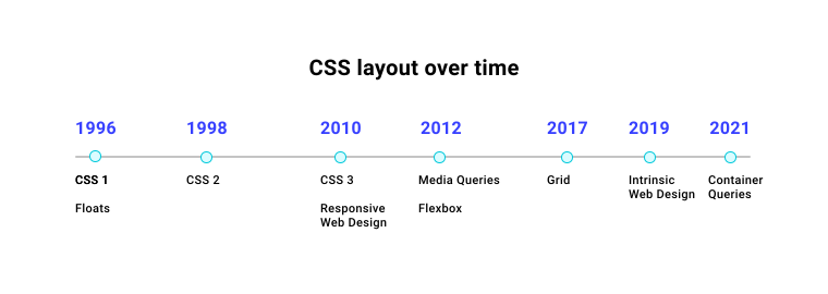
Modern CSS layout tools are incredibly powerful. We have dedicated systems for page layout. Let’s look at the basic building block of every layout first.
The display property serves two main purposes.
First, it determines if a box behaves as an inline or block element.
.my-element {
  display: inline;
}
Inline elements flow like words in a sentence.
They sit side by side in the writing direction.
Common elements like span and strong are inline by default and preserve the spacing around them.
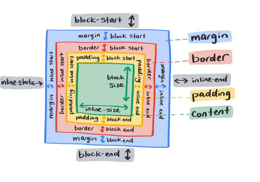
You can’t set an explicit width or height on inline elements. Surrounding elements will also ignore any vertical margin or padding you apply to them.
.my-element {
  display: block;
}
Block elements don’t sit next to each other. They start on a new line. By default, a block element expands to fill the available inline space, spanning the full width of its parent container. The browser respects margin and padding on all four sides of a block element.
.my-element {
  display: flex;
}
The display property also determines how the children of an element behave.
Setting an element to display: flex turns it into a block-level container and converts its children into flex items.
This lets you use properties that control alignment, order, and spacing.
Flexbox and grid are the main layout engines in modern CSS. They share some behaviors but solve different layout problems.
Let’s look at a high-level summary of what they do. We will cover both in detail in the next few lessons.
.my-element {
  display: flex;
}
Flexbox is built for one-dimensional layouts. It arranges items along a single axis, either horizontally or vertically. By default, a flex container lines its children up side by side and stretches them to match the height of the tallest item.
Flex items stay on a single line and won’t wrap by default when space runs out. Instead, they shrink to fit the container. You can adjust this behavior using alignment and wrapping properties.
Because children become flex items, you can control how they grow and shrink.
The flex property lets you define these sizing rules on individual items.
.my-element div {
  flex: 1 0 auto;
}
The flex property is shorthand for flex-grow, flex-shrink, and flex-basis.
You can write them out separately if you prefer.
.my-element div {
  flex-grow: 1;
  flex-shrink: 0;
  flex-basis: auto;
}
These rules tell the browser how to distribute space when screen sizes change. This flexibility makes flexbox a great tool for responsive interfaces.
.my-element {
  display: grid;
}
Grid is built for two-dimensional layouts. It controls both rows and columns at the same time.
Grid introduces layout primitives like the repeat() and minmax() functions.
It also introduces the fr unit, which represents a fraction of the remaining space in the container.
You can build a responsive twelve-column layout with just three lines of CSS.
.my-element {
  display: grid;
  grid-template-columns: repeat(12, 1fr);
  gap: 1rem;
}
Flexbox treats items as a single row or column. Grid gives you coordinates to place items exactly where you want them in two dimensions. For example, we can make the first item span two rows and three columns.
.my-element :first-child {
  grid-row: 1/3;
  grid-column: 1/4;
}
This tells the first child to span from the first column line to the fourth, and from the first row line to the third.
If you don’t use grid or flexbox, elements render in normal flow. You can use a few layout methods to tweak their positioning within this normal flow.
Inline elements ignore vertical margin and padding, but you can change that with inline-block.
p span {
  display: inline-block;
}
This gives you an element that flows inline with text but respects block-level sizing and margins.
p span {
  margin-top: 0.5rem;
}If you want text to wrap around an image like in a newspaper layout, you can use floats.
img {
  float: left;
  margin-right: 1em;
}
The float property pushes an element to the left or right, allowing surrounding text to flow around it.
You can float elements left, right, or set them to inherit.
Using float can disrupt the layout of elements that follow.
You can fix this by clearing the float using clear: both on subsequent elements, or by applying display: flow-root on the parent container.
This establishes a new block formatting context and wraps the floated items.
Displaying a long list of items can force users to scroll a lot. It also leaves empty space on the side of the page. CSS multicolumn layout lets you split lists into columns easily.
.countries {
  column-count: 2;
  column-gap: 1em;
}
This splits the list into two equal columns with a gap between them.
You can also specify a minimum width for columns instead of a fixed count.
.countries {
  width: 100%;
  column-width: 260px;
  column-gap: 1em;
}
The browser will automatically create more columns when screen width increases and reduce them on smaller screens.
The position property changes how an element relates to the normal document flow and other boxes.
The options are relative, absolute, fixed, sticky, and static.
.my-element {
  position: relative;
  top: 10px;
}
A relative element is offset from its default spot.
Setting position: relative also makes the element a containing block for any absolute descendants.
Their absolute offsets will calculate relative to this element instead of the page.
.my-element {
  position: relative;
  width: 100px;
  height: 100px;
}

.another-element {
  position: absolute;
  bottom: 0;
  right: 0;
  width: 50px;
  height: 50px;
}
An absolute element is pulled completely out of the document flow.
You can position it anywhere inside its relative parent using top, right, bottom, and left.
The surrounding content behaves as if the absolute element does not exist.
Fixed elements act like absolute ones, but they anchor to the viewport. They stay locked in place as you scroll.
Sticky elements act like relative items until you scroll past them. At that point, they anchor to their offset values like a fixed element.
Adapted from Learn CSS © Google and contributors, licensed under CC BY 4.0 (prose) and Apache 2.0 (code samples).