Title here
Summary here
HTML tables are used for displaying tabular data with rows and columns. The
decision to use a <table> should be based on the content you are presenting
and your users’ needs in relation to that content. If data is being presented,
compared, sorted, calculated, or cross-referenced, then <table> is probably
the right choice. If you simply want to lay out non-tabular content neatly, such
as a large group of thumbnail images, tables are not appropriate: instead,
create a list of images and style the
grid with CSS.
In this section, we are going to discuss all the elements that make up the table, along with some accessibility and usability features you should consider as you present tabular data. While Learn HTML isn’t fundamentally about CSS, and there is an entire course dedicated to learning CSS, we will cover some table-specific CSS properties.
The <table> tag wraps the table content, including all the table
elements. The implicit ARIA role of a <table> is table; assistive
technologies know this element is a table structure containing data arranged in
rows and columns. If the table maintains a selection state, has two-dimensional
navigation, or allows the user to rearrange cell order, set
role="grid". If the rows of the grid can be expanded and
collapsed, use role="treegrid" instead.
Inside the <table>, you’ll find the table headers (<thead>), table bodies
(<tbody>), and, optionally, table footers (<tfoot>). Each of these is made
up of table rows (<tr>). Rows contain table header (<th>) and table data
(<td>) cells which, in turn, contain all the data. In the DOM, before any of
this, you may find two additional features: the table caption (<caption>) and
column groups (<colgroup>). Depending on whether or not the <colgroup> has a
span attribute, it may contain nested table column (<col>) elements.
The table’s children are, in order:
<caption> element<colgroup> elements<thead> elements<tbody> elements<tfoot> elementsWe’ll cover the <table> elements’ children, which are all optional but
recommended, then take a look at rows, table header cells, and table data cells.
The <colgroup> will be covered last.
Being a native, semantic element, <caption> is the preferred
method of giving a name to a table. The <caption> provides a descriptive,
programmatically associated table title. It is visible and available to all
users by default.
The <caption> element should be the first element nested in the <table>
element. Including it lets all users know the purpose of the table immediately
without having to read the surrounding text. Alternatively, you can use
aria-label or aria-labelledby on the <table> to provide an accessible name
as the caption. The <caption> element has no element-specific attributes.
The caption appears outside the table. The location of the caption can be set
with the CSS caption-side property, which is a better
practice than using the deprecated align attribute. This can set the caption
to the top and bottom. The left and right side positioning, with inline-start
and inline-end, are not yet fully supported. Top is the default browser
presentation.
Preferably, data tables should have clear headers and a caption, and be simple
enough to be almost self-explanatory. Bear in mind that not all users have the
same cognitive abilities. When the table is “making a point”, or otherwise needs
interpretation, provide a brief summary of the main point or function of the
table. Where that summary is placed depends on its length and complexity. If
brief, use it as the inner text of the caption. If longer, summarize it in the
caption, and provide the summary in the paragraph preceding the table,
associating the two with the aria-describedby attribute.
Putting the table in a <figure> and putting the summary in the <figcaption>
is another option.
The content of tables is made up of up to three sections: zero or more table
headers (<thead>) , table bodies (<tbody>), and table footers (<tfoot>).
All are optional, with zero or more of each being supported.
These elements don’t help or hinder the accessibility of the table, but they are
useful in terms of usability. They provide styling hooks. For example, the
header contents can be made sticky, while the <tbody>
contents can be made to scroll. Rows not nested in one of these three containing
elements are implicitly wrapped in a <tbody>. All three share the same
implicit role rowgroup. None of these three elements has
any element-specific attributes.
What we have so far:
<table>
  <caption>
    MLW Students
  </caption>
  <thead></thead>
  <tbody></tbody>
  <tfoot></tfoot>
</table>
The <tfoot> element was originally specified to come right after the <thead>
and before the <tbody> for accessibility reasons, which is why you may come
across this non-intuitive source order in legacy codebases.
Tables can be divided into table headers, bodies, and footers, but none of these
really does anything if the tables do not contain table rows, cells, and
content. Each table row, <tr> contains one or more cells. If a cell is a
header cell, use <th>. Otherwise, use <td>.
User-agent stylesheets generally display the content in a <th> table header
cell as centered and bold. These default styles, and all styling, are best
controlled with CSS instead of the deprecated attributes that used to be
available on individual cells, rows, and even the <table>.
There were attributes to add padding between cells and within cells, for
borders, and for text alignment. Cellpadding and cellspacing, which define the
space between the content of a cell and its border, and between the borders of
adjacent cells, should be set with the CSS border-collapse and
border-spacing properties, respectively. Border-spacing will
have no effect if border-collapse: collapse is set. If
border-collapse: separate; is set, it’s possible to hide empty cells
completely with empty-cells: hide;. To learn more about styling tables, here’s
an interactive slidedeck of table-related CSS styles.
In the examples, we’ve added a border on the table and each individual cell with CSS to make some features more apparent:
In this example, we have a caption, a table header, and a table body. The header
has one row containing three header <th> cells, thereby creating three
columns. The body contains three rows of data: the first cell is a header cell
for the row, so we use <th> instead of <td>.
The <th> cell has semantic meaning, with implicit ARIA roles of
columnheader or rowheader. It defines the cell as
the header for the column or row of table cells, depending on the value of the
enumerated scope attribute. The browser will default to col or row if
scope is not explicitly set. Because we have used semantic markup, the 1956
cell has two headers: Year and Lou Minious. This association tells us that
“1956” is the “year” of graduation for “Lou Minious”. In this example, as we can
see the entire table, the association is visually apparent. Using <th>
provides the association even when the header column or row has scrolled out of
view. We could have explicitly set <th scope="col">Year</th> and
<th scope="row">Lou Minious</th> but with a simple table like this, the
enumerated default values work. Other values for scope include rowgroup and
colgroup, which are useful with complex tables.
Similar to MS Excel, Google Sheets, and Numbers, it is possible to join multiple
cells into a single cell. This is done with HTML! The colspan attribute is
used to merge two or more adjacent cells within a single row. The rowspan
attribute is used to merge cells across rows, being placed on the cell in the
top row.
In this example, the table header contains two rows. The first header row
contains three cells spanning four columns: the middle cell has colspan="2".
This merges two adjacent cells. The first and last cells include rowspan="2".
This merges the cell with the cell in the adjacent row, immediately beneath it.
The second row in the table header contains two cells; these are the cells for the second and third columns in the second row. No cell is declared for the first or last column as the cell in the first and last columns in the first row span two rows.
In cases where a cell is defined by multiple header cells with associations that
cannot be set by the scope attributes alone, include the headers attribute
with a space-separated list of the associated headers. As this example is a more
complex table, we explicitly define the scope of the headers with the scope
attribute. To be even clearer, we added the headers attribute to each cell.
The headers attributes were possibly not necessary in such a simple use case,
but they are important to have in your toolbelt as your tables grow in
complexity. Tables with complex structures, such as tables where headers or
cells are merged or with more than two levels of column or row headers, require
explicit identification of associated header cells. In such complex tables,
explicitly associate each data cell with each corresponding header cell with a
list of space-separated id values of all the associated headers as the value
of the headers attribute.
The headers attribute is more commonly found on <td> elements, but is also
valid on <th>.
That said, complex table structures can be difficult for all users, not just screen reader users, to understand. Cognitively and in terms of screen reader support, simpler tables, with few to no spanned cells, even without adding scope and headers, are more easily understood. They’re also easier to manage!
There are two relatively obscure elements that were briefly mentioned: the
column group, <colgroup>, element and its only descendant, the
empty <col> column element. The <colgroup> element is used to
define groups of columns, or <col> elements, within a table.
If used, the column grouping should be nested in the <table>, immediately
after the <caption> and before any table data. If they span more than one
column, use the span attribute.
The content outline order for a table is generally as follows, with <table>
and <caption> being the two elements that should be included:
<table>
  <caption>
    Table Caption
  </caption>
  <colgroup>
    <col />
  </colgroup>
  <thead>
    ...
  </thead>
</table>
Neither <colgroup> nor <col> has semantic meaning in terms of helping to
make the table more accessible, but they do allow for limited column styling,
including setting a width for the column with CSS.
<col> styles will style a column as long as there are no <td> or <th>
styles that override that styling. For example, when <colspan> is used to
merge cells in some rows of a table but not all, you can’t be sure that a
selector such as tr > *:nth-child(8), which selects the 8th child of every
row, will highlight the 8th column in full or will highlight the 8th column for
several rows, but with a smattering of 9th and 10th column cells, depending on
what row or column cells were merged.
Unfortunately, only a few properties are supported, the styles aren’t inherited
into the cells, and the only way of using the <col> element in targeting cells
is with a complex selector including the :has() relational
selector.
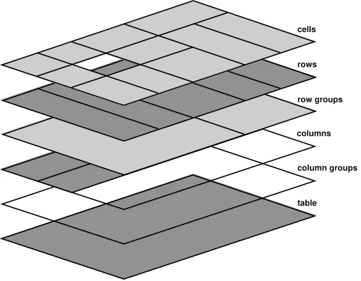
If both the <table> and the <colgroup> have a background color, the
background-color of the <colgroup> will be on top. The order of drawing is:
table, column groups, columns, rowgroups, rows, with cells last and on top, as
shown in the schema of table layers. The <td> and <th> elements
are not descendants of <colgroup> or <col> elements, and do not inherit
their styling.
To stripe a table, CSS structural selectors come in handy. For example,
tbody tr:nth-of-type(odd) {background-color: rgba(0 0 0 / 0.1);} will add a
translucent black to each odd row in the body of the table, letting any
background effects that are set on <colgroup> show through.
Tables are not responsive by default. Rather, they are sized according to their
content by default. Extra measures are needed to get table layout styling to
effectively work across a variety of devices. If you are changing the CSS
display property for table elements, include ARIA role attributes.
While that may sound redundant, the CSS displayproperty can affect the
accessibility tree in some browsers.
Table elements have semantic meanings that are used by assistive technologies to
enable navigating through the rows and columns without getting ’lost’. The
<table> element shouldn’t be used for presentation. If you need a heading over
a list, use a header and a
list. If you want to lay out content in many columns, use
multi-column layout. If you want to lay out content in a grid, use
CSS grid. Only use a table for data. Think of it this way: if
your data requires a spreadsheet in order to be presented at a meeting,
use<table>. If you would like to use the features available in presentation
software like Keynote or Powerpoint, you probably need a
description list.
If you’re not presenting tabular data, don’t use a <table>. If you do use a
table for presentation, set role="none".
Many developers use tables to lay out forms but there is no need to. But you do need to know about HTML forms, so we will cover that next.
Learn HTML © 2022 by Estelle Weyl, CC BY 4.0.