Title here
Summary here
Most sites and applications include a web form. Joke sites, like
<DoWebsitesNeedToLookExactlyTheSameInEveryBrowser.com> may not have a form, but
even <MachineLearningWorkshop.com> (MLW), which originated as an April Fool’s
day joke, has a form, albeit a fake one. MLW’s main “call to action” is a
registration form for machines to sign up for a workshop. This form is contained
in a <form> element.
The HTML <form> element identifies a document
landmark containing interactive controls for submitting
information. Nested in a <form> you’ll find all the interactive (and
non-interactive) form controls that make up that form.
HTML is powerful. This section focuses on the power of HTML, covering what HTML can do without adding JavaScript. Using form data client-side to update the UI in some way generally involves CSS or JavaScript, which is not discussed here. There is an entire Learn Forms course. We won’t duplicate that section here, but we will introduce several form controls and the HTML attributes that empower them.
With forms, you can enable users to interact with your website or application,
validate the information entered, and submit the data to a server. HTML
attributes can enable requiring the user to select form controls or enter a
value. HTML attributes can define specific criteria that the value must match to
be valid. When the user tries to submit the form, all the form control values go
through
client-side constraint validation and
can prevent submission until the data matches the required criteria; all without
JavaScript. You can also turn this feature off: setting the
novalidate attribute on the <form> or, more often,
formnovalidate on a button, saving the form data for later completion,
prevents validation.
Forms are submitted when the user activates a submit button nested within the
form. When using <input> for buttons, the ‘value’ is the button’s label, and
is displayed in the button. When using <button>, the label is the text between
the opening and closing <button> tags. A submit button can be written either
of two ways:
<input type="submit" value="Submit Form" />
<button type="submit">Submit Form</button>
For a very simple form, you need a <form> element, with some form inputs
inside, and a submit button. However, there is more to submitting a form than
that.
The attributes of the <form> element set the HTTP method by which
the form is submitted and the URL that processes the form submission. Yes, forms
can be submitted, processed, and a new page can be loaded without any
JavaScript. The <form> element is that powerful.
The <form> element’s action and method attribute
values define the URL that processes the form data and the HTTP method used to
submit the data, respectively. By default, the form data gets sent to the
current page. Otherwise, set the action attribute to the URL of where the data
should be sent.
The data sent is made up of name/value pairs of the form’s various form
controls. By default, this includes all the form controls nested within the form
that have a name. However, with the form attribute, it is possible to
include form controls outside the <form> and to omit form controls nested
within the <form>. Supported on form controls and <fieldset>, the form
attribute takes as its value the id of the form the control it is associated
with, not necessarily the form it is nested in. This means form controls don’t
need to be physically nested in a <form>.
Warning
Be careful though: using the form attribute makes it possible to disassociate
a form control from its form by including it with an empty or erroneous value.
The method attribute defines the HTTP protocol of the request: generally GET
or POST. With GET, the form data is sent as a parameter string of
name=value pairs, appended to the action’s URL.
With POST, the data is appended to the body of the HTTP request. When sending
secure data, such as passwords and credit card information, always use POST.
There is also a DIALOG method. If a <form method="dialog"> is within a
<dialog>, submitting the form will close the dialog; there is a submit event
though the data is neither cleared nor submitted. Again, without JavaScript.
This is discussed in the dialog section. Just note, because
this doesn’t submit the form, you probably want to include both
formmethod="dialog"and formnovalidate on the submit button.
Form buttons can have more than the attributes described at the start of this
section. If the button includes a formaction, formenctype, formmethod,
formnovalidate, or formtarget attribute, the values set on the button
activating the form submission take precedence over the action,
enctype, method, and target set on the
<form>. Constraint validation occurs prior to form submission, but only if
there is neither a formnovalidate on the activated submit button nor a
novalidate on the <form>.
To capture which button was used to submit a form, give the button a name.
Buttons with no name or value don’t get sent with the form data on form
submission.
When the user submits a completed online form, the names and values of the
relevant form controls get submitted. The name is the value of the name
attribute. The values come from the contents of the value attribute or the
value entered or picked by the user. The value of a <textarea> is its inner
text. The value of a <select> is the selected <option>’s value or, if the
<option> doesn’t include a value attribute, the value is the selected
option’s inner text.
<form method="GET">
  <label for="student">Pick a student:</label>
  <select name="student" id="student">
    <option value="hoover">Hoover Sukhdeep</option>
    <option>Blendan Smooth</option>
    <option value="toasty">Toasty McToastface</option>
  </select>
  <input type="submit" value="Submit Form" />
</form>
Pick a student: Hoover Sukhdeep Blendan Smooth Toasty McToastface
Selecting “Hoover Sukhdeep” (or doing nothing, as the browser displays and therefore selects the first option value by default) and then clicking the submit button will reload this page, setting the URL to:
https://web.dev/learn/html/forms?student=hooverBecause the second option doesn’t have a value attribute, the inner text is
submitted as the value. Selecting “Blendan Smooth” and clicking the submit
button will reload this page, setting the URL to:
https://web.dev/learn/html/forms?student=Blendan+SmoothWhen a form is submitted, the information sent includes the names and values of
all named form controls that have a name except non-selected checkboxes,
non-selected radio buttons, and the names and values of any buttons other than
the one that submitted the form. For all other form controls, if the form
control has a name, but no value was entered or defaulted, the form control’s
name gets submitted with an empty value.
There are 22 input types, so we can’t cover them all. Just note
that including a value is optional, and often a bad idea, when you want the user
to enter information. For <input> elements where the user can’t edit the
value, you should always include a value, including for input elements with a
type of hidden, radio, checkbox, submit, button, and reset.
Using unique names for form controls makes server-side data processing simpler
and is recommended, with checkboxes and radio buttons being exceptions to this
rule.
If you have ever noticed that when you select a radio button within a group of
radio buttons, only one can be selected at a time, this is due to the name
attribute. This only-one-can-be-selected effect is created by giving each radio
button in a group the same name.
A name should be unique to the group: if you accidentally use the same name
for two separate groups, selecting a radio button in the second group will
deselect any selection made in the first group with the same name.
The name along with the value of the selected radio button are submitted
with the form. Make sure each radio button has a relevant (and usually unique)
value. The values of the non-selected radio buttons are not sent.
You can have as many radio groups on a page as you like, with each group working
independently, as long as each has a unique-to-the-group name.
If you want to load the page with one of the radio buttons in a same-named group
selected, include the checked attribute. This radio button will match the
:default CSS pseudo-class, even if the user selects a different
radio. The currently selected radio button matches the :checked
pseudo-class.
If the user is required to pick a radio control from a group of radio buttons,
add the required attribute to at least one of the controls.
Including required on a radio button in a group makes a selection required for
form submission, but it doesn’t have to be the radio with the attribute that
gets selected to be valid. Also, indicate clearly in the <legend> that the
form control is required. The labeling of groups of radio buttons
along with each individual button is described later on.
It’s valid for all checkboxes within a group to have the same name. Only
selected checkboxes have their name and value submitted with the form. If
you have multiple checkboxes with the same name selected, the same name will be
submitted with (hopefully) different values. If you have multiple form controls
with the same name, even if they are not all checkboxes, they will all get
submitted, separated by ampersands.
If you don’t include a value on a checkbox, the value of the selected
checkboxes will default to on, which probably isn’t helpful. If you have three
checkboxes named chk and they’re all checked, the form submission will not be
decipherable:
https://web.dev/learn/html/forms?chk=on&chk=on&chk=onTo make a checkbox required, add the required attribute. Always inform the
user when a checkbox must be checked, or when any form control is required.
Adding required to a checkbox only makes that checkbox required; it does not
impact other checkboxes with the same name.
In order for users to know how to fill out a form, the form has to be
accessible. Every form control must have a label. You also want to label groups
of form controls. While individual input, select, and text areas are labeled
with <label>, groups of form controls are labeled by the contents of the
<legend> of the <fieldset> that groups them.
In the previous examples, you may have noticed that each form control except the
submit button had a <label>. Labels provide form controls with accessible
names. Buttons get their accessible name from their content or value. All the
other form controls require an associated <label>. If there is no associated
label, the browser will still render your form controls, but users will not know
what information is expected.
To explicitly associate a form control with a <label>, include the for
attribute on the <label>: the value being the id of the form
control it is associated with.
<label for="full_name">Your name</label>
<input type="text" id="full_name" name="name" />
Your name
Associating labels with form controls has several benefits. Labels make form controls accessible to screen reader users by providing the control with an accessible name. Labels are also “hit areas”; they make the site more usable for users with dexterity issues by increasing the area. If you’re using a mouse, try clicking anywhere on the label “Your name”. Doing so gives the input focus.
To provide implicit labels, include the form control between the opening and
closing <label> tags. This is equally accessible from both a screen reader and
pointer device perspective, but doesn’t provide the styling hook like the
explicit label.
<label
  >Your name
  <input type="text" name="name" />
</label>
Your name
As labels are “hit areas”, don’t include interactive elements within an explicit label, or any other interactive components other than the labeled form control in an implicit label. For example, if you include a link in a label, while the browser will render the HTML, your users will be confused if they click on the label to enter a form control but are redirected to a new page.
Generally, the <label> comes before the form control except in the case of
radio buttons and checkboxes. This isn’t required. It’s just the common UX
pattern. The Learn Forms series has information about form design.
For groups of radio buttons and checkboxes, the label provides the accessible
name for the form control it is associated with; but the group of controls and
their labels also need a label. To label the group, group all of the elements
into a <fieldset>, with the <legend> providing the label for the group.
<fieldset>
  <legend>Who is your favorite student?</legend>
  <ul>
    <li>
      <label>
        <input type="radio" value="blendan" name="machine" /> Blendan Smooth
      </label>
    </li>
    <li>
      <label>
        <input type="radio" value="hoover" name="machine" /> Hoover Sukhdeep
      </label>
    </li>
    <li>
      <label>
        <input type="radio" value="toasty" name="machine" /> Toasty McToastface
      </label>
    </li>
  </ul>
</fieldset>
In this example, the implicit <label>s each label a radio button and the
<legend> provides the label for the group of radio buttons. Nesting a
<fieldset> inside another <fieldset> is standard practice. For example, if a
form is a survey of many questions divided into groups of related questions, the
“favorite student” <fieldset> may be nested in another <fieldset> labeled as
“Your favorites”:
<fieldset>
  <legend>Your favorites:</legend>
  <ul start="6">
    <li>
      <fieldset>
        <legend>Who is your favorite student?</legend>
        <ul>
          <li>
            <!-- the rest of the code here -->
          </li>
        </ul>
      </fieldset>
    </li>
  </ul>
</fieldset>
These elements’ default appearances have led to their underuse, but <legend>
and <fieldset> can be styled with CSS. In addition to all the
global attributes, <fieldset> also supports the name, disabled, and form
attributes. When you disable a fieldset, all nested form controls are disabled.
Neither the name nor the form attributes have much use on the <fieldset>.
The name can be used to access the fieldset with JavaScript, but the fieldset
itself is not included in submitted data (the named form controls nested within
are included).
Note
Note: You can learn more about forms and accessibility in the forms module of Learn Accessibility
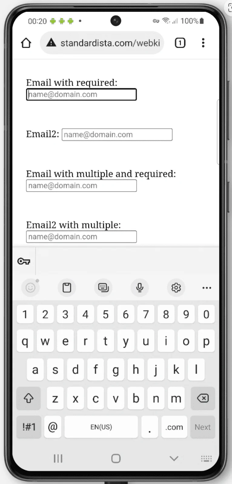
As noted earlier, there are 22 different types of inputs. In some
cases, when a user is on a device with a dynamic keyboard that displays only as
needed, such as a phone, the input type used determines the type of keyboard
displayed. The default keyboard shown can be optimized for the type of input
required. For example, type tel will show a keypad optimized for entering
telephone numbers; email includes the @ and .; and the dynamic keyboard
for url includes a colon and the slash symbol. Unfortunately, the iPhone still
doesn’t include : in the default dynamic keyboard for url input types.
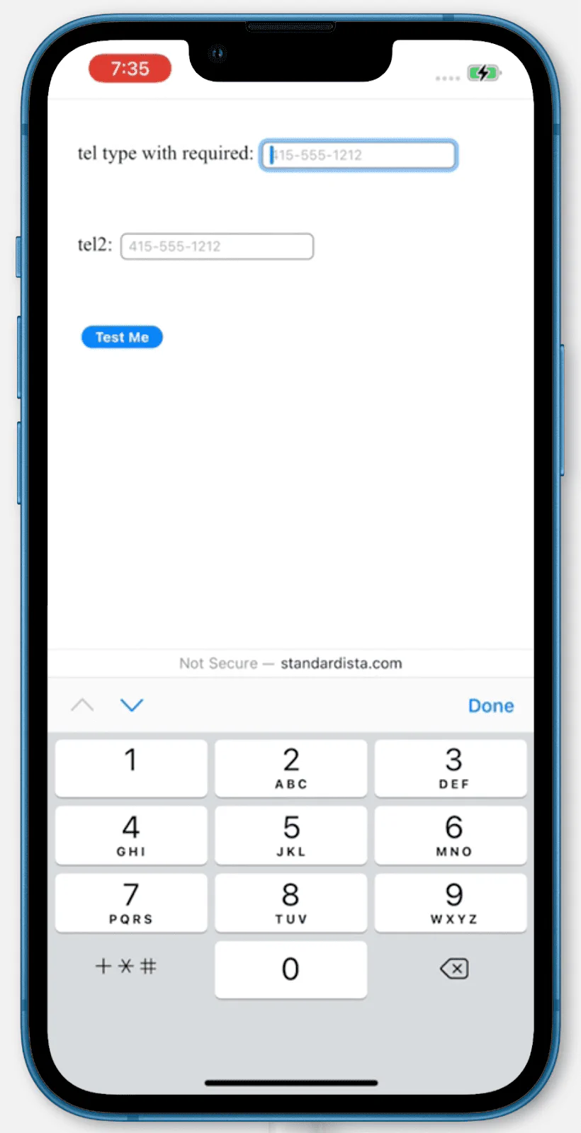
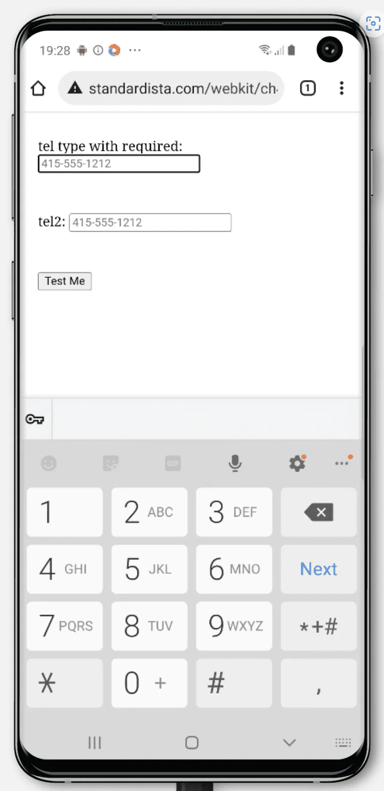
Keyboards for <input type="tel"> on iPhone and two different Android phones:

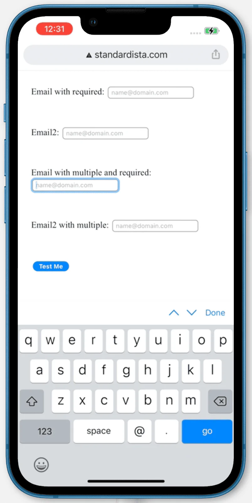
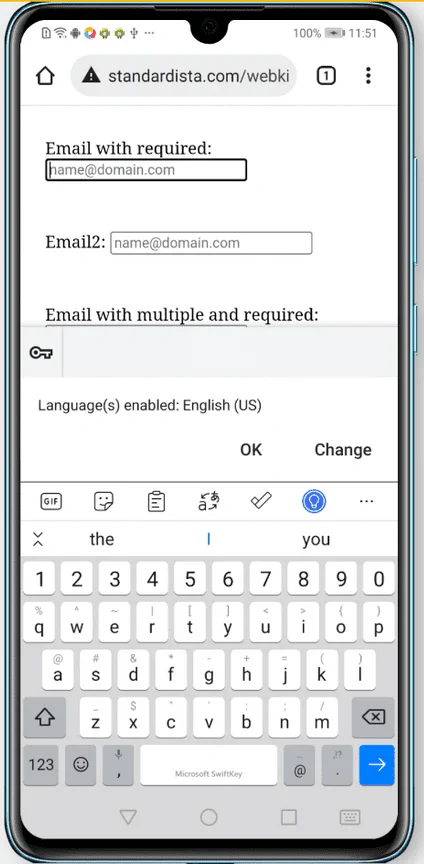
Keyboards for <input type="email"> on iPhone and two different Android phones:
The file input type <input type="file"> enables uploading files via forms.
Files can be of any type, defined and limited by the accept
attribute. The list of acceptable file types can be a comma-separated list of
file extensions, a global type, or a combination of global types and extensions.
For example, accept="video/*, .gif" accepts any video files or animated gifs.
Use “audio/*” for sound files, “video/*” for video files, and “image/*”
for image files.
The enumerated capture attribute, defined in the media capture
specification, can be used if a new media file is to be created using
the user’s camera or microphone. You can set the value to user for the
user-facing input devices or environment for the phone’s back camera or
microphone. Generally, using capture, without a value, works because the user
is going to pick which input device they want to use.
<label for="avatar">A recent photo of yourself:</label>
<input type="file" capture="user" accept="image/*" name="avatar" id="avatar" />Again, without including any JavaScript, HTML can prevent forms with invalid values from being submitted.
There are some CSS selectors that match form controls based on the presence of
HTML attributes including :required and :optional if
the boolean required is set or not; :default if
checked is hard-coded; and :enabled or
:disabled, depending on whether the element is interactive and
if the disabled attribute is present. The
:read-write pseudoclass matches elements with
contenteditable set and form controls that are by default
editable, such as number, password, and text input types (but not
checkbox, radio buttons, or the hidden type, among others). If a normally
writable element has the readonly attribute set, it will match
:read-only instead.
As the user enters information into form controls, the CSS UI selectors,
including :valid, :invalid,
:in-range, and :out-of-range will toggle on
and off depending on the state. When the user exits a form control, either the
not-yet fully supported :user-invalid or
:user-valid pseudo-class will match.
You can use CSS to provide cues about whether form controls are required and valid as the user interacts with the form. You can even use CSS to prevent users from being able to click the submit button until the form is valid:
form:invalid [type="submit"] {
  opacity: 50%;
  pointer-events: none;
}
This CSS snippet is an anti-pattern. While your UI may feel intuitive and clear, many users attempt to submit a form to enable error messaging. Making a submit button appear disabled in this way doesn’t allow for constraint validation, a feature many users rely on.
Applied CSS is updated continuously based on the current state of the UI. For
example, when you include input types with constraints, such as email,
number, url and date types, if the value is non-null (not empty) and the
current value is not a valid email, number, URL, date or time, the :invalid
CSS pseudo-class will be a match. This constant updating is
different from built-in HTML constraint validation, which only occurs when the
user attempts to submit the form.
Built-in constraint validation is only relevant to constraints set with HTML
attributes. While you can style an element based on the :required and
:valid/:invalid pseudoclasses, the browser supplied error messages stemming
from errors based on the required, pattern, min, max, and even type
attributes, come at form submission.
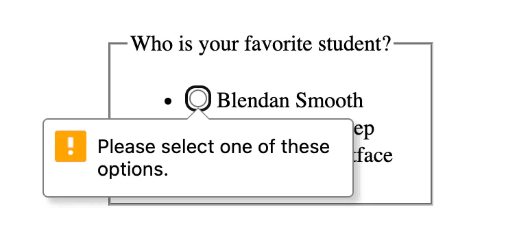
When we attempt to submit the form without picking the required favorite
student, constraint validation prevents form submission because of a
validityState.valueMissing error.
If any of the validityState properties return true, submission is blocked,
and the browser displays an error message in the first incorrect form control,
giving it focus. When the user activates a form submission and there are invalid
values, the first invalid form control will show an error message and receive
focus. If a required control has no value set, if a numeric value is out of
range, or if a value is not of the type required by the type attribute, the
form will not validate, will not submit, and an error message will appear.
If a number, date, or time value is below the minimum min set or above the
maximum max set the control will be :out-of-range (and
:invalid), and the user will be informed of the
valididityState.rangeUnderflow,
validityState.rangeOverflow error when they try to submit
the form. If the value is out of step with the step value, whether explicitly
set or defaulting to 1, the control will be :out-of-range (and :invalid)
and there will be a validityState.stepMismatch error. The
error appears as a bubble and by default provides helpful information on how to
rectify the mistake.
There are similar attributes for the length of values: the
minlength and maxlength attributes will alert
the user of an error with the validityState.tooLong or
validityState.tooShort on submission. The maxlength also
prevents the user from entering too many characters.
Using the maxlength attribute can lead to a poor user experience. It’s
generally a better experience to allow the user to enter more than the allowed
character length providing a counter, optionally in the form of an
<output> element, which is not submitted with the form, enabling
them to edit down the text until the output shows the maximum allowed length has
not been exceeded. The maxlength can be included in your HTML; like everything
we’ve discussed, it works without JavaScript. Then, on load, the value of the
maxlength attribute can be used to create this character counter in JavaScript.
Some input types appear to have default constraints, but don’t. For example, the
tel input type provides for a numeric telephone keypad on devices with dynamic
keyboards, but doesn’t constrain valid values. For this, and other input types,
there is the pattern attribute. You can specify a regular expression the value
needs to match to be considered valid. If a value is the empty string, and the
value is not required, it will not cause a
validityState.patternMismatch error. If required and empty, the
default error message for validityState.valueMissingwill be shown to the user,
rather than the patternMismatch.
For emails, the validityState.typeMismatch is probably too
forgiving for your needs. You will likely want to include the
pattern attribute so intranet email addresses without a
TLD aren’t accepted as valid. The pattern attribute enables providing
a regular expression that the value must match. When requiring a pattern match,
ensure it is very clear to the user what is expected.
All of this can be done without a single line of JavaScript, but being an HTML API, you can use JavaScript to include custom messages during constraint validation. You can also use JavaScript to update how many characters are left, show a progression bar for password strength, or any other number of ways to dynamically improve completion.
This example has a form within a <dialog> with a nested <form> with three
form controls and two submit buttons, with clear labels and instructions.
The first submit button closes the dialog. Use formmethod="dialog" to override
the form’s default method, and close the <dialog> without submitting the data
or erasing it. You must also include the formnovalidate otherwise the browser
will try to validate checking that all the required fields have a value. The
user may want to close the dialog and form without entering any data; validation
would prevent this. Include aria-label="close" because “X” is a known visual
cue but is not a descriptive label.
The form controls all have implicit labels, so you don’t need to include id or
for attributes. The input elements both have the required attribute making
them required. The number input has the step explicitly set to demonstrate how
step is included. As step defaults to 1, this attribute can be omitted.
The <select> has a default value making the required attribute unnecessary.
Instead of including the value attribute on each option, the value defaults to
the inner text.
The submit button at the end sets the forms method to POST. When clicked, the
validity of each value will be checked. If all values are valid, the form data
will be submitted, the dialog will close, and the page may redirect to
thankyou.php, which is the action URL. If any values are missing, or if the
numeric value has a step mismatch or is out of range, a relevant browser defined
error message will appear, the form will not be submitted, and the dialog will
not close. The default error messages can be customized with the
validityState.setCustomValidity('message here') method. Just
note that if you set a custom message, the message must be explicitly set to the
empty string when everything is valid or the form will not submit.
Extended code formatting
Note: These <input> elements include a slash at the end, also called a
“self-closing tag”, which is a misnomer. The slash on void elements is a feature
of XML, including SVG and XHTML, but not HTML. Browsers ignore it,
Prettier requires it, and the HTML Validator
throws a warning when encountered. As the slash makes it easier to read markup
and some template engines require it, many view including this slash as a good
habit. Others view this slash as against the spec, which it isn’t, a waste of
two bytes, which it arguably might be, and a possible cause of problems. The
slash only causes problems if you neither quote your attributes nor put a space
between the attribute and the end of the tag. In this case, the slash will be
part of the attribute value. Because of this unquoted attribute issue, including
the slash may actually encourage quoting attributes, which most developers
consider to be a best practice. As you learn HTML, it is helpful to code in as
legible a manner as possible, which includes “closing” all tags and quoting all
attributes. As you become more familiar with all the intricacies of HTML and
your comfort level improves, you may change your habits to no longer adding a
slash to void elements, omitting optional closing tags, and even omitting
implicit tags altogether, and leaving quotes off attributes that allow for it.
The important thing, whether you are coding CSS, HTML, JavaScript, or other, is
to be consistent in your coding style.
There is an entire section devoted to helping your users enter the right data in forms. For good user experience, it is important to prevent users from making errors by including instructions and providing hints as necessary. While this section covers how HTML alone can provide validation client-side, validation must be both client-side and server-side. Validation can be provided in unobtrusive ways during form completion, such as adding a check mark when the value is correct. Do not provide error messaging before the form control is complete though. If the user does make a mistake, inform the user where the mistake is and what they got wrong.
When designing forms, it’s important to remember that there are different standards of names, address formats, and more around the world. Someone may have a single letter as a last name (or no last name at all), may not have a zip code, might have a three-line street address, or may not have a street address. This person may be viewing a translated version of your form.
Form controls, their labels, and the error messages should be visible on the
screen, accurate and meaningful, programmatically determinable, and
programmatically associated with the appropriate form element or group. The
autocomplete attribute can and should be used to enable faster
form completion and improve accessibility.
HTML provides all the tools for making basic form controls accessible. The more interactive a form element or process is, the more attention needs to be given to accessibility with respect to focus management, setting and updating ARIA names, roles, and values, where necessary, and ARIA live announcements as required. But, as we’ve learned here, with HTML alone, you can get a long way to your goal of accessibility and validity without resorting to ARIA or JavaScript.
Learn HTML © 2022 by Estelle Weyl, CC BY 4.0.